Design Objective:
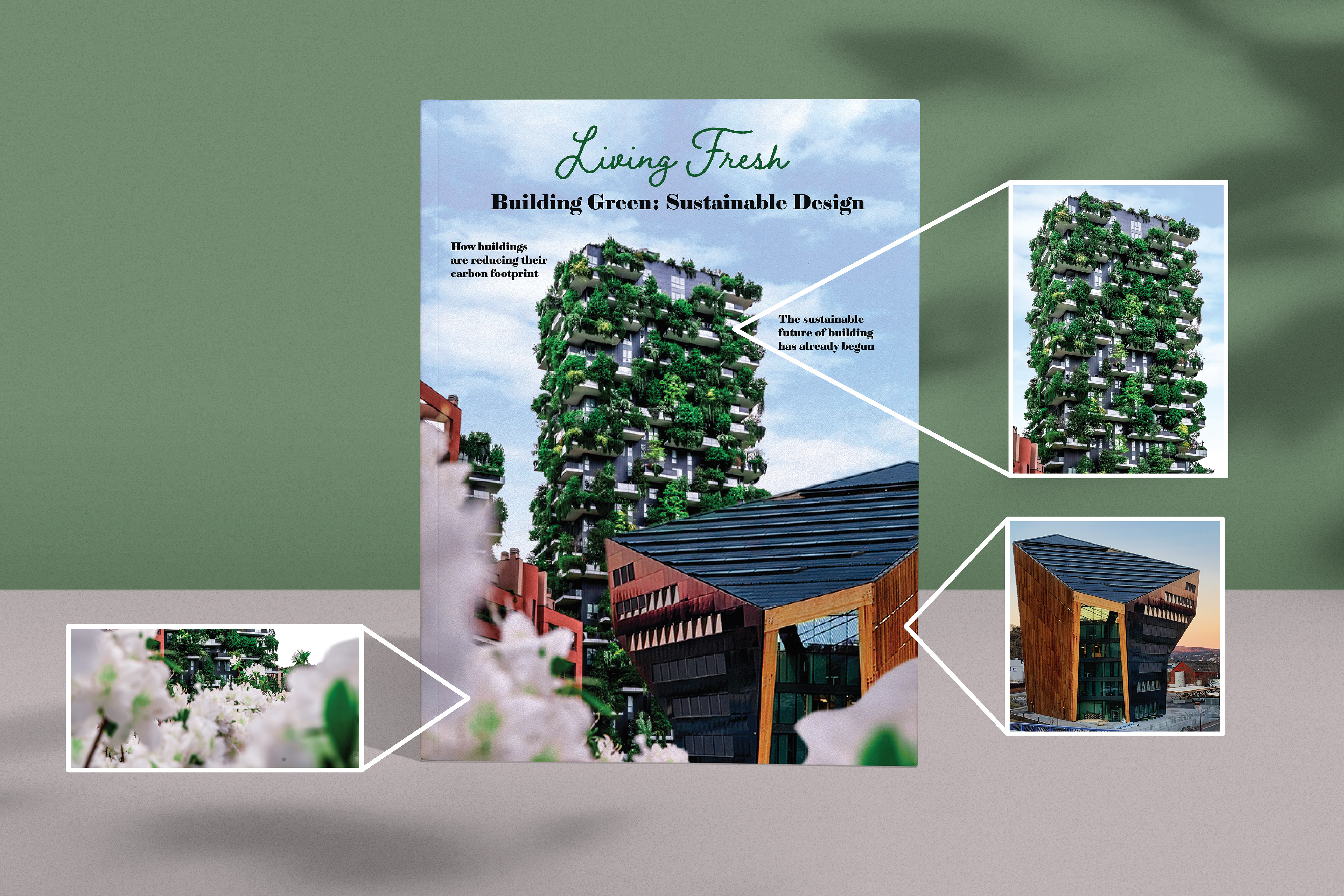
Develop a three-spread layout with a composite cover for a print and digital publication. Write an original article for the magazine and include a sidebar article. The imagery should relate to the article written.
Design Brief:
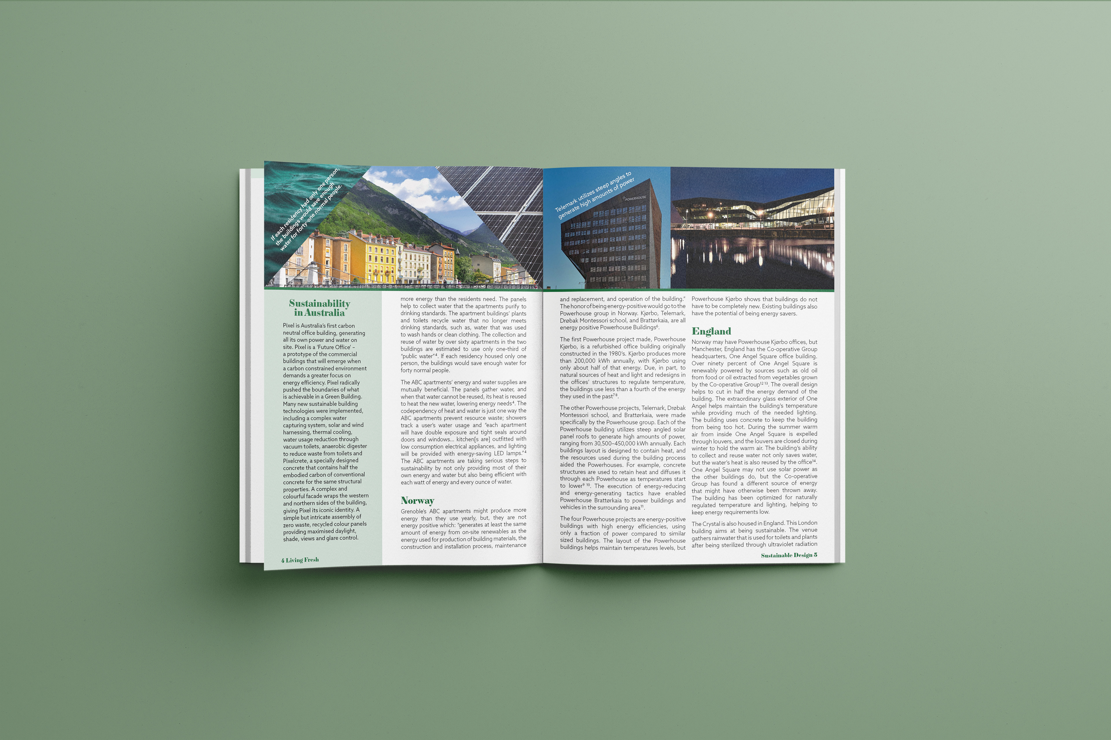
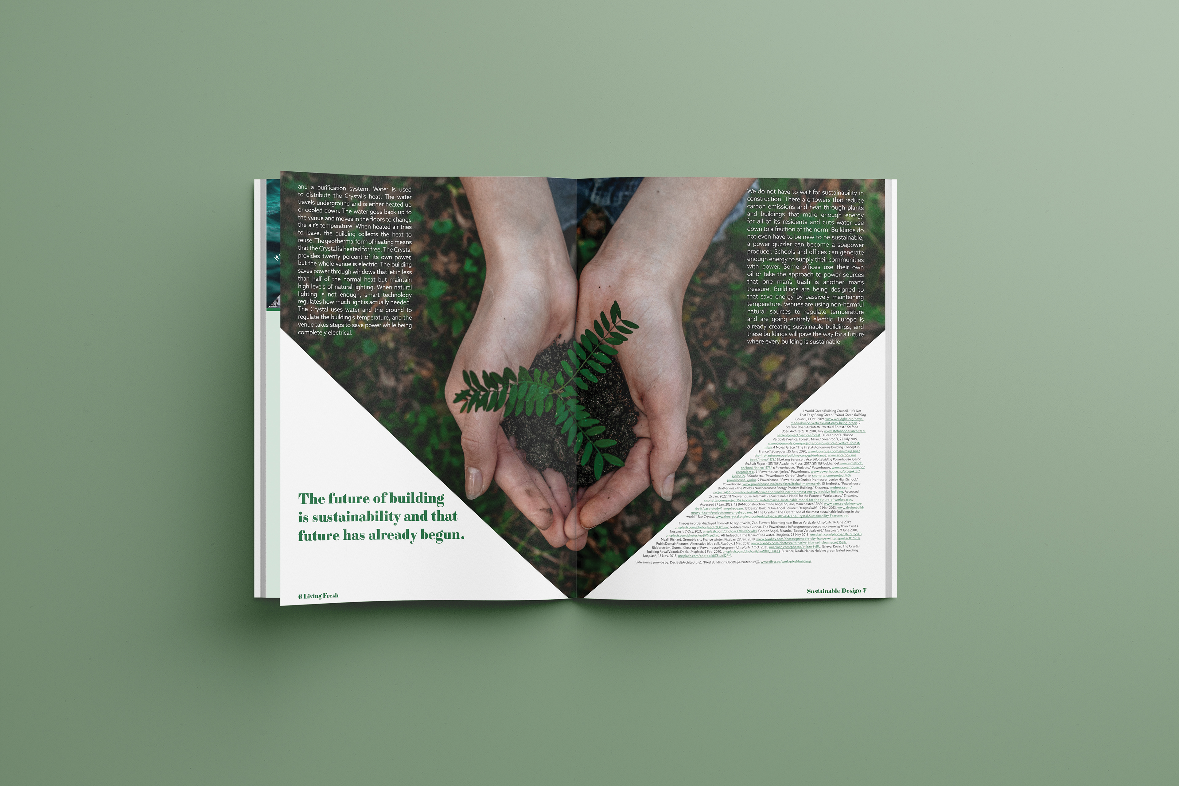
This project’s article is on Sustainable Design of Buildings. Through color, images, and typography, the magazine combines organic and structured designs. Aspects of these buildings, organic, nature, and stability are represented through the green color palette. All of the image frames are polygons with straight lines triangles, rectangles, etc. Images blend organic and geometric by showing the rectangular design but incorporate the surrounding organic aspects. Each section includes an image depicting a building from that nation. Two triangle image frames on page 4 are dark to balance each other visually and contrast each other conceptually. The left frame is an organic substance made of organic lines while the right frame is mechanical with rectangles making up the panels. On the final spread, the image is organic but the frame and text create illusions of being geometric. Cupped hands follow the tip of the frame making a more angular appearance and the text laying on either side of the arms covers the space more evenly. The title and headers are done in a serif typeface, reflecting the clean, sharp style of the buildings. The body copy is a geometric sans-serif emphasizing a structured appearance. It also creates contrast with the headers with its lighter weight and lower stroke contrast. Pull quotes mimic angles from the corresponding image. The quotes are in white to help tie in the white text on the final spread. Page 6 has a pull quote that reiterates the thesis of the article. A composite of different buildings in the article forms the cover. All of the photos have been color corrected in Photoshop to create a more harmonious appearance throughout the article.
