Design Objective:
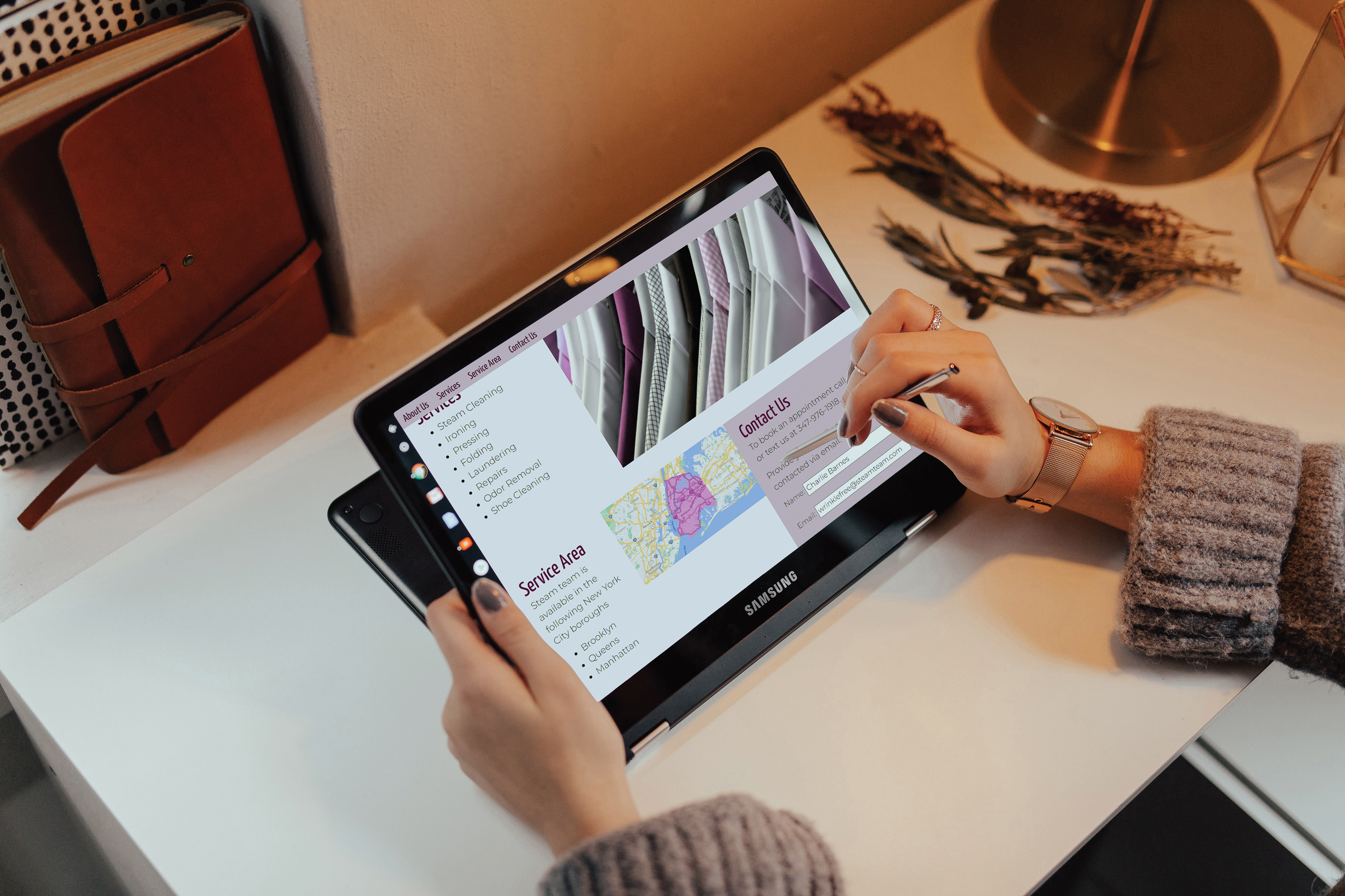
Using a graphically reduced household object, create a business identity and logo. The logo should have one-color and two-color variations. Create a brand identity package and an additional item related to the brand. Expand the brand with a coded responsive microsite.
Design Brief:
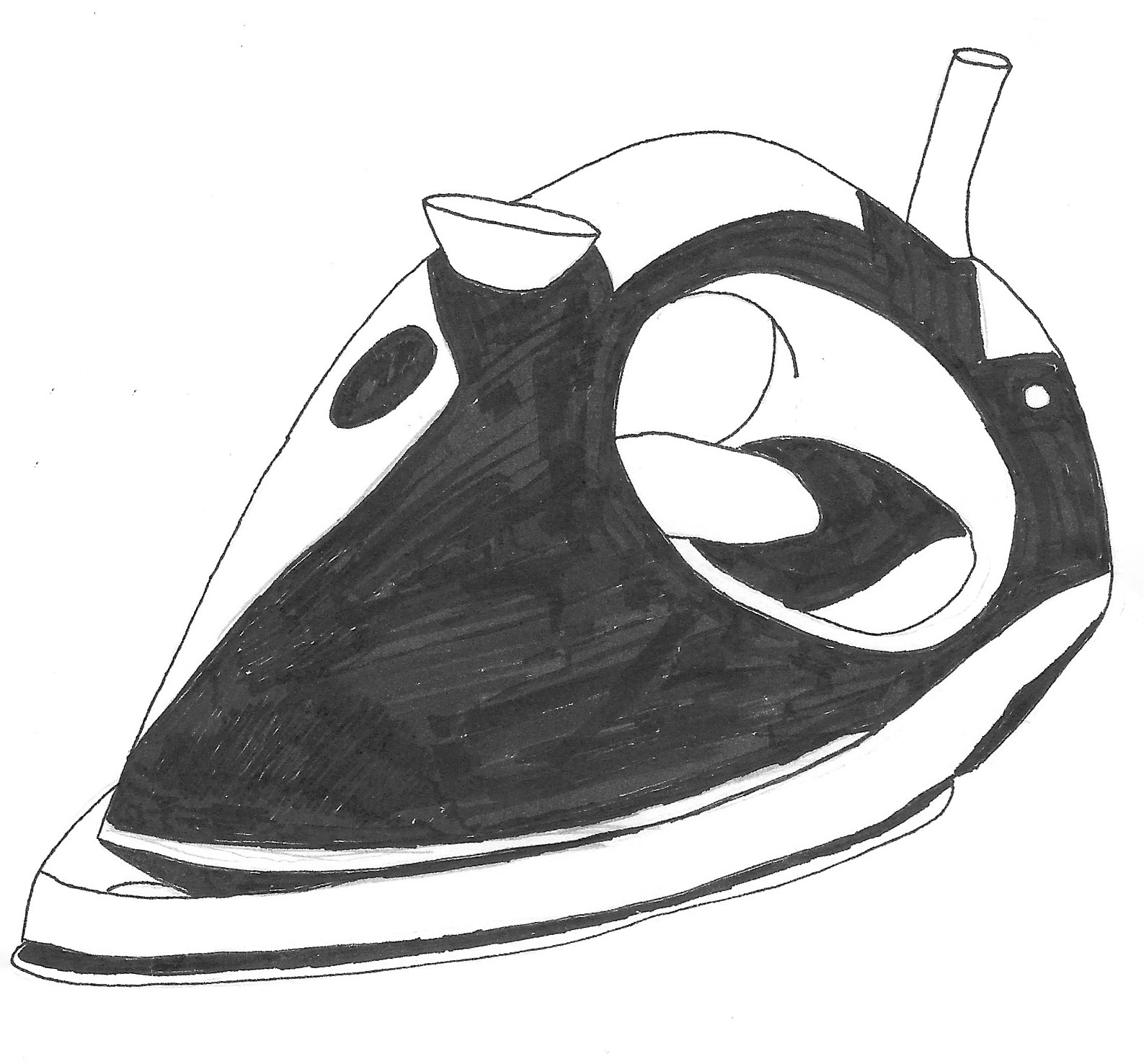
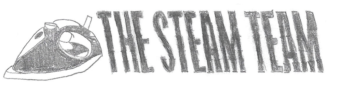
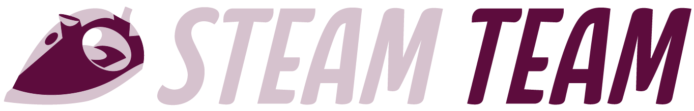
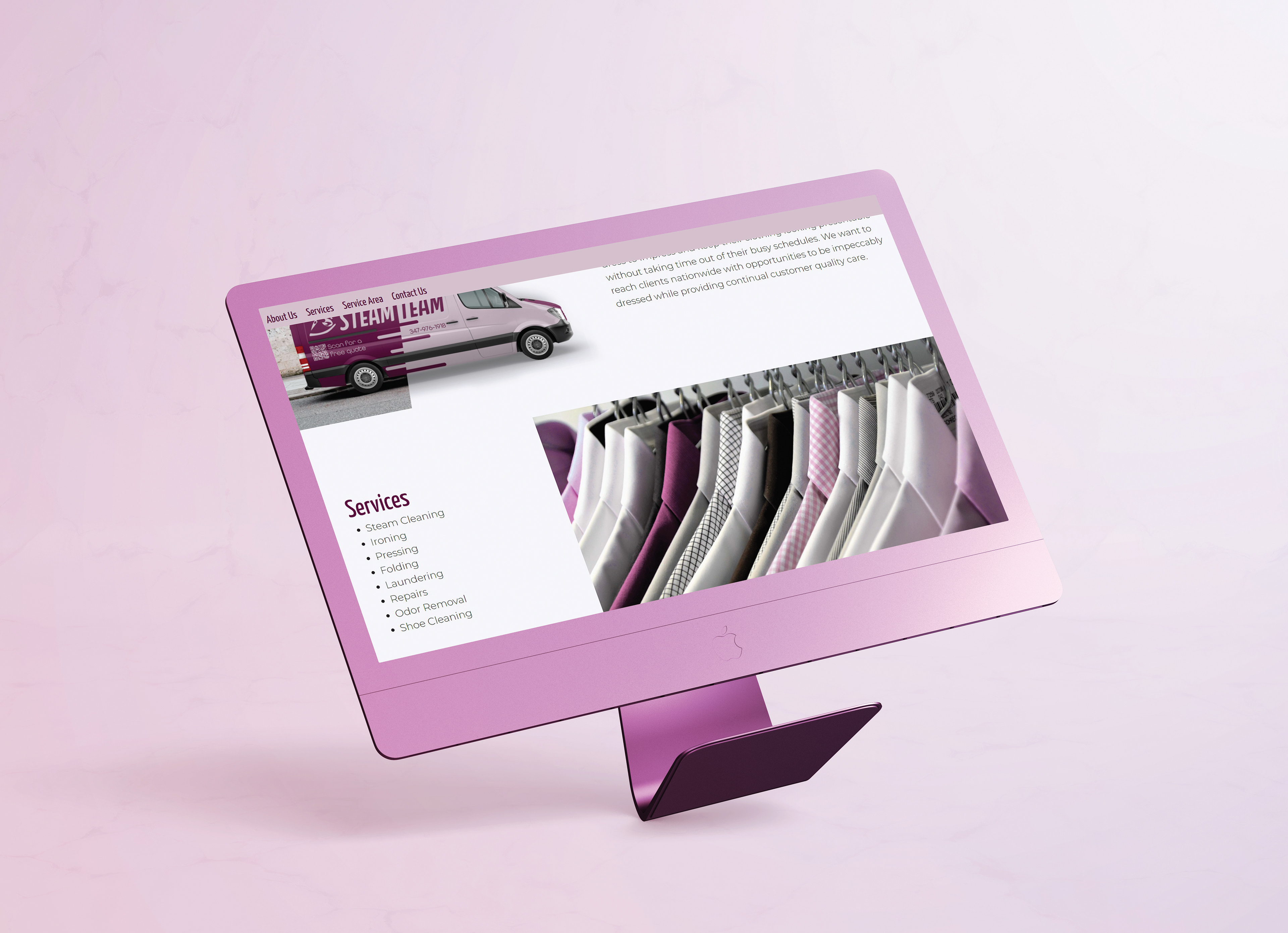
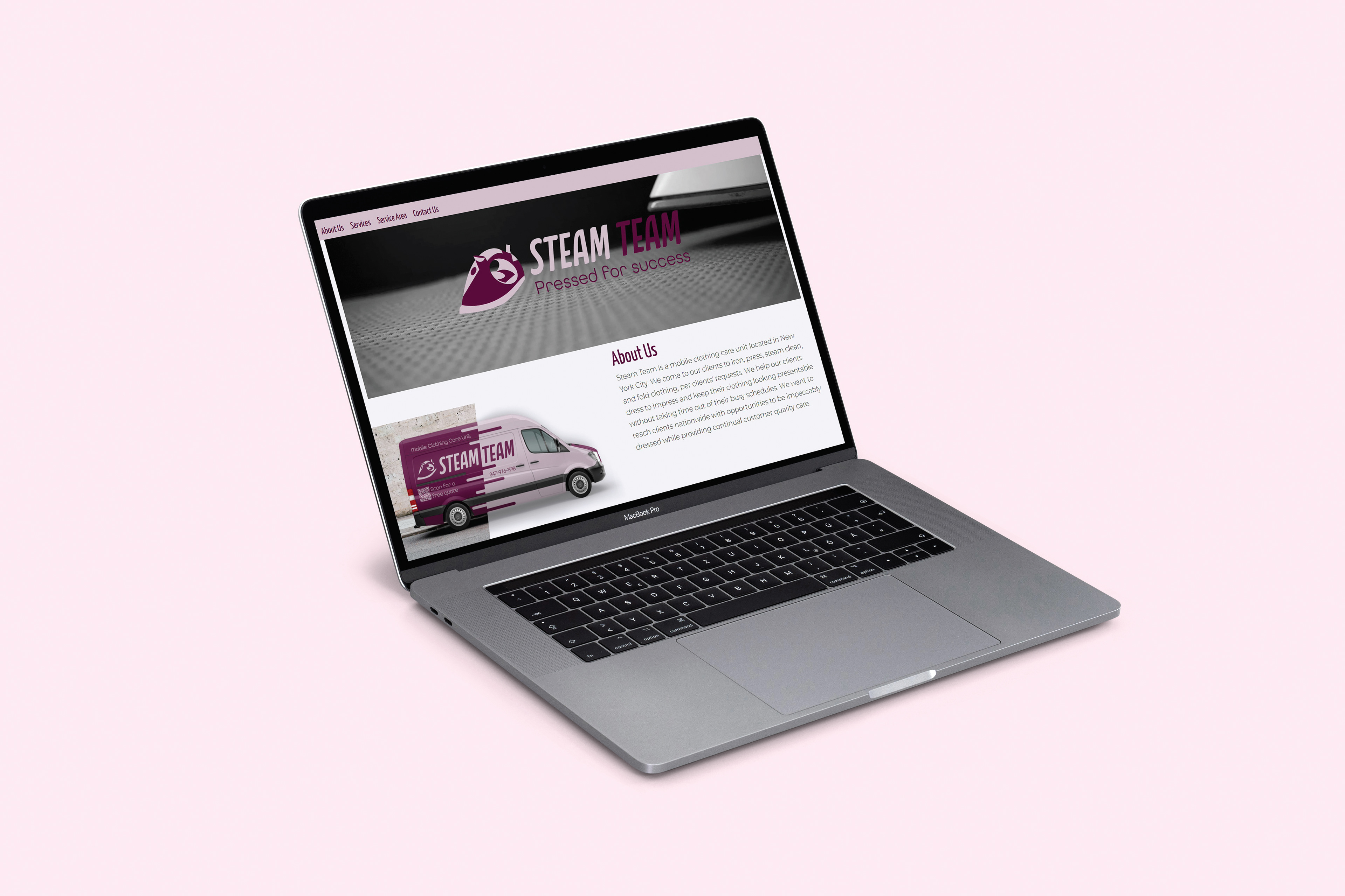
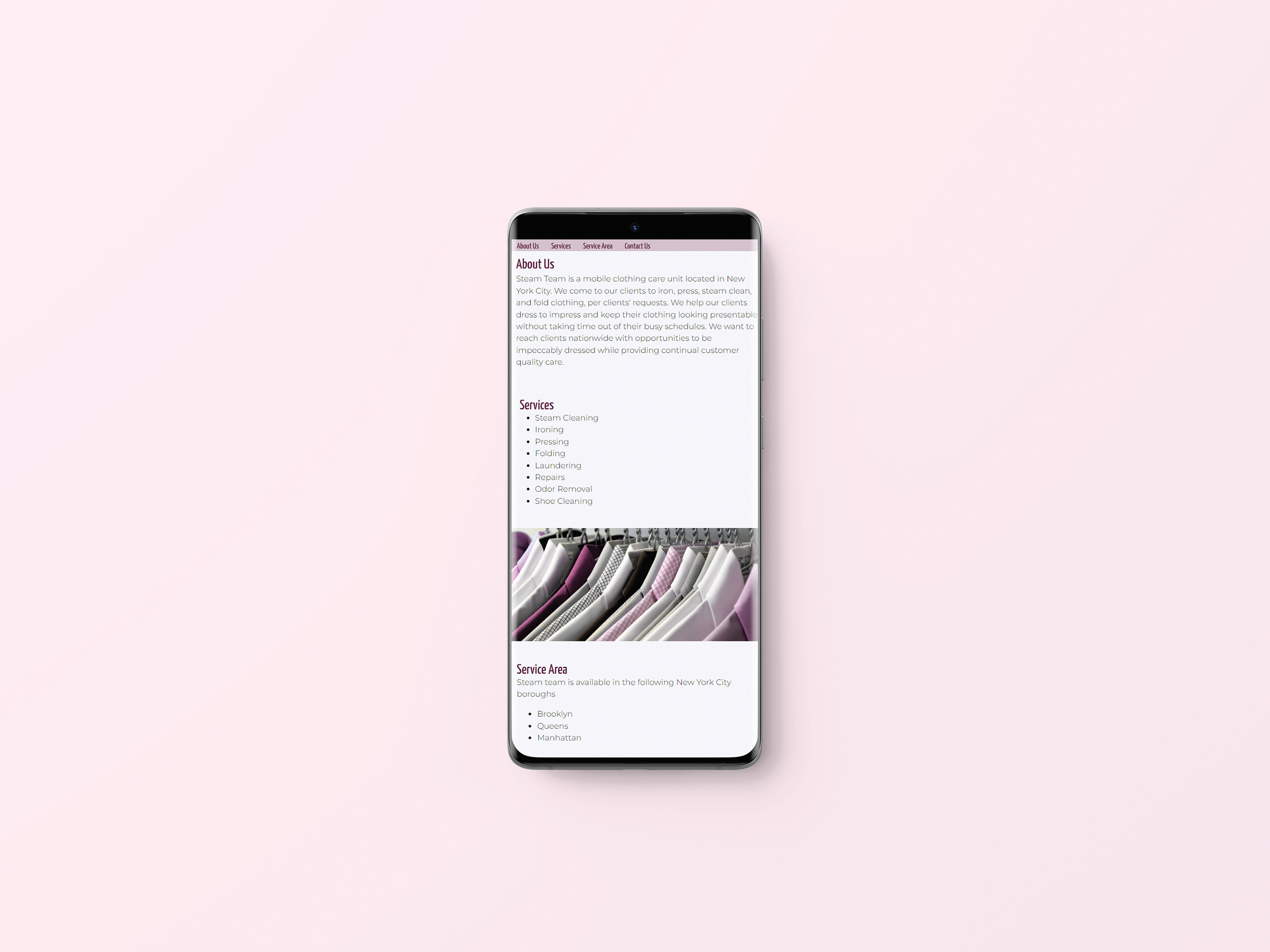
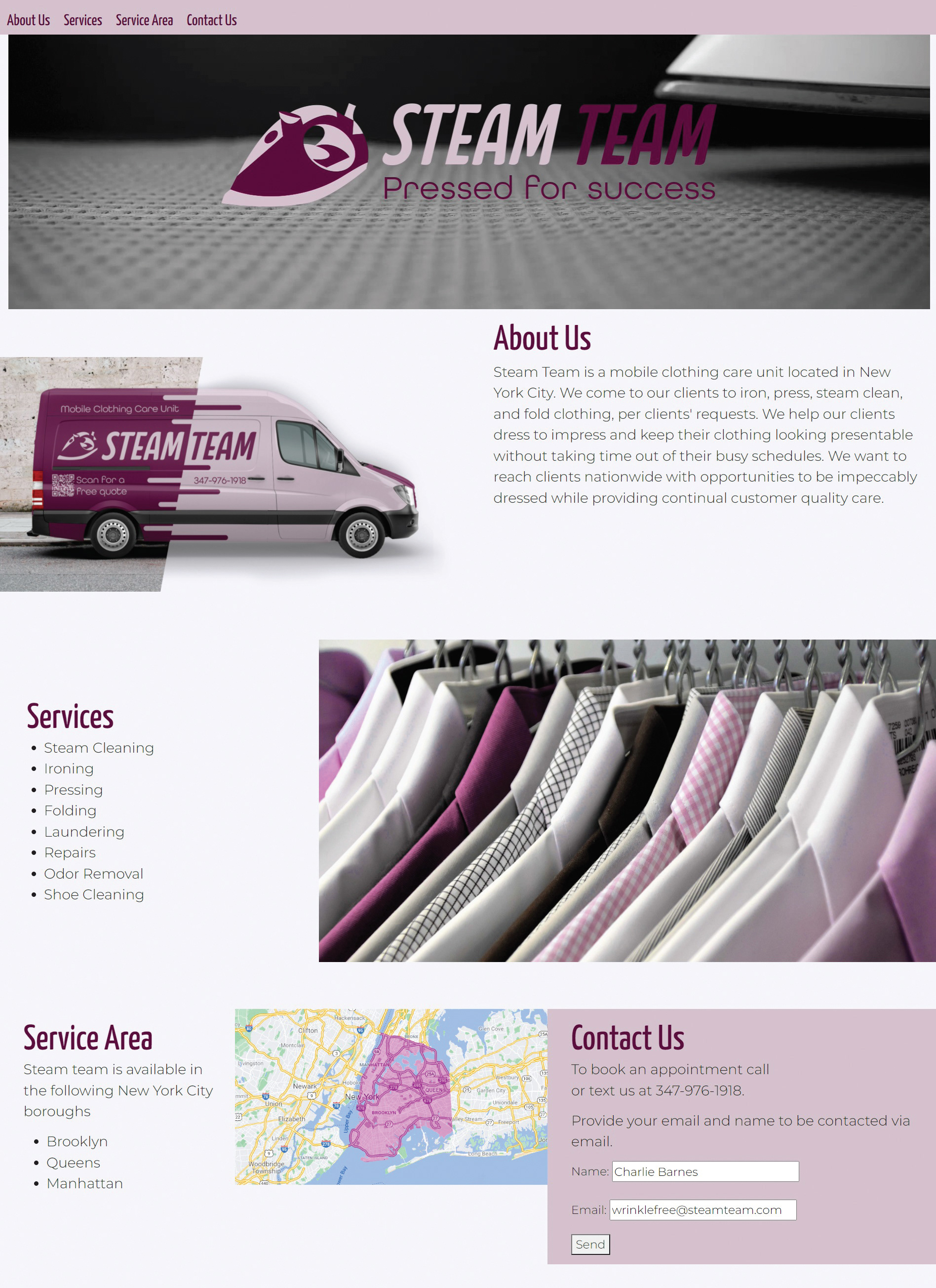
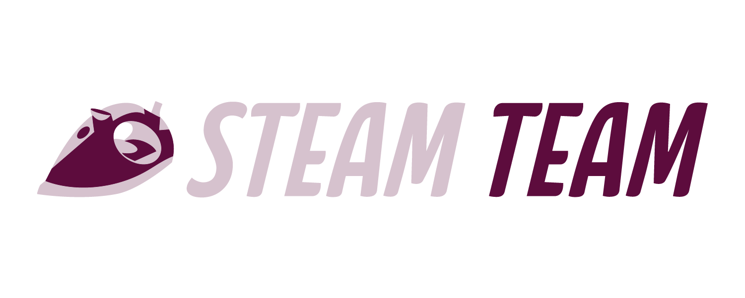
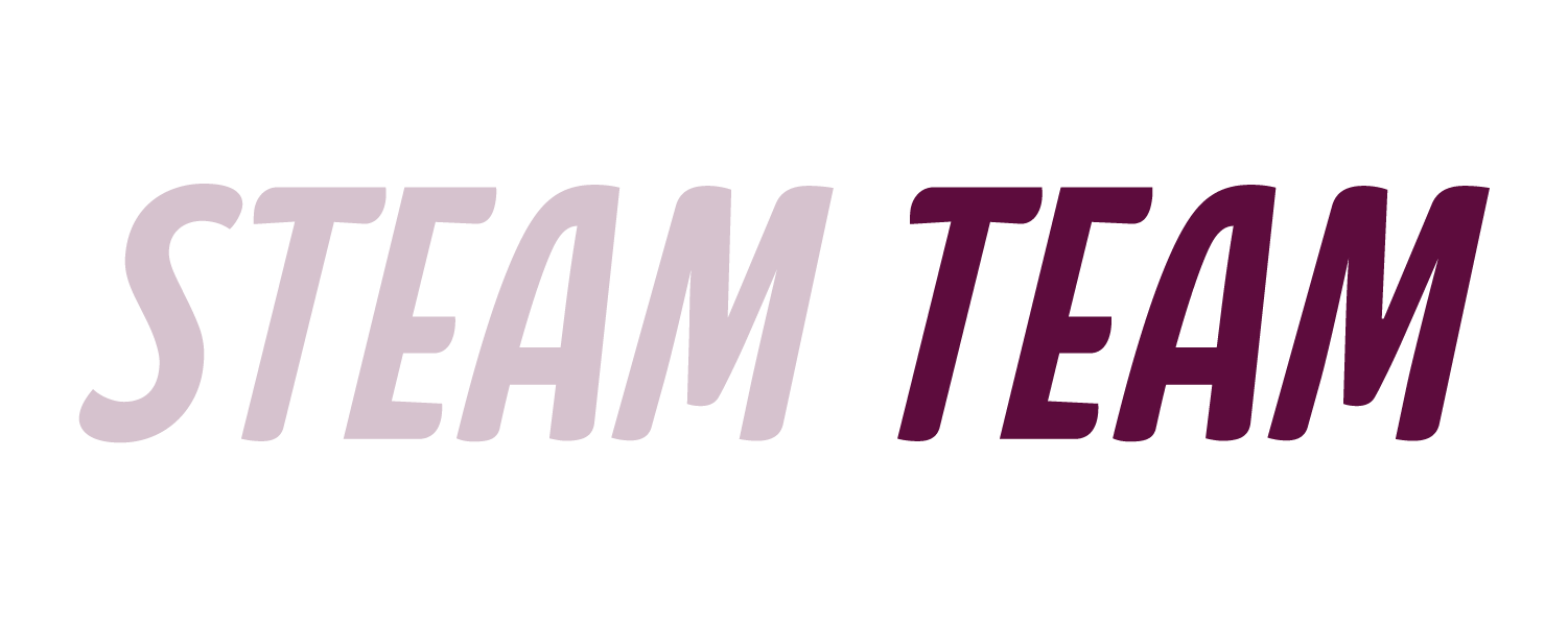
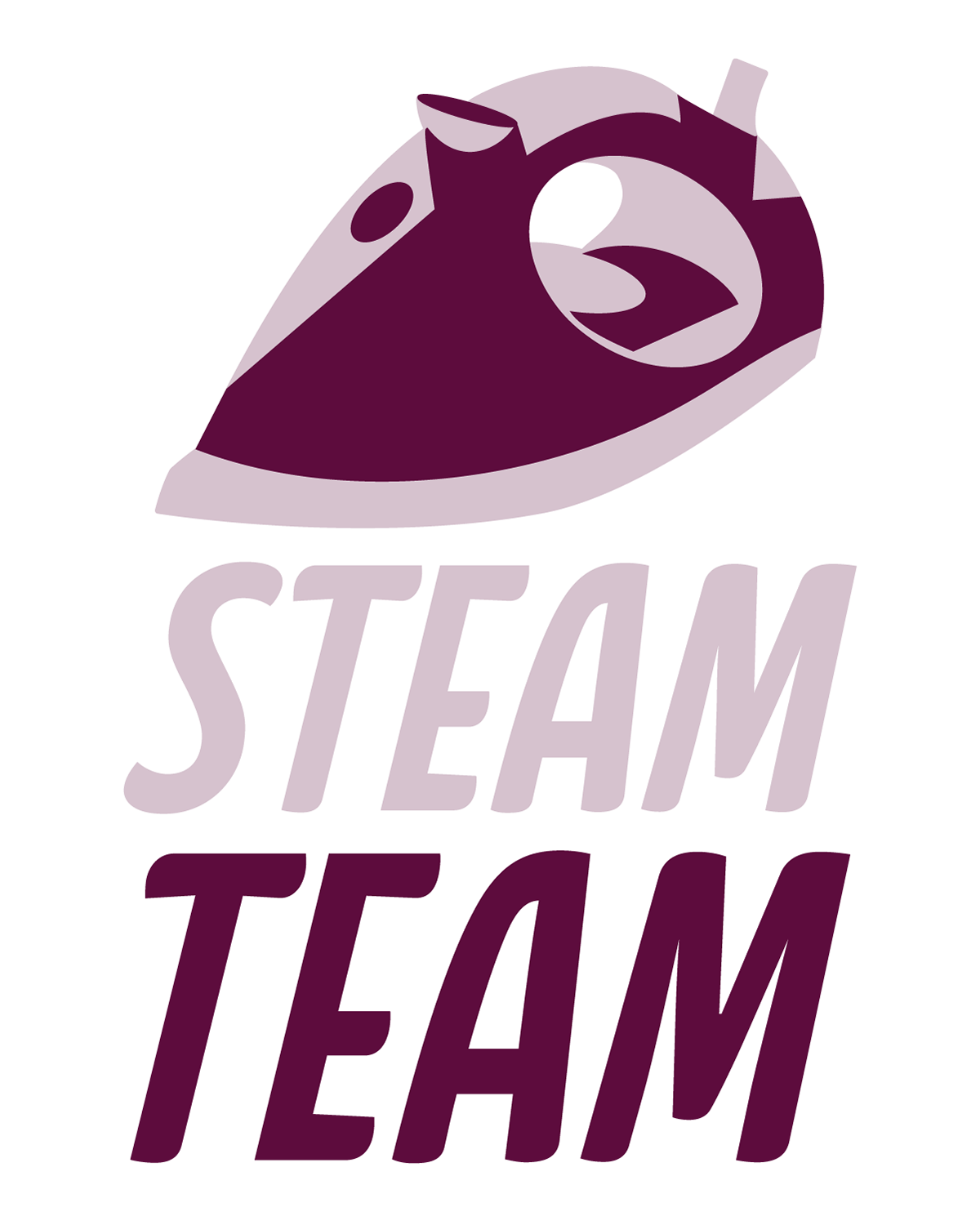
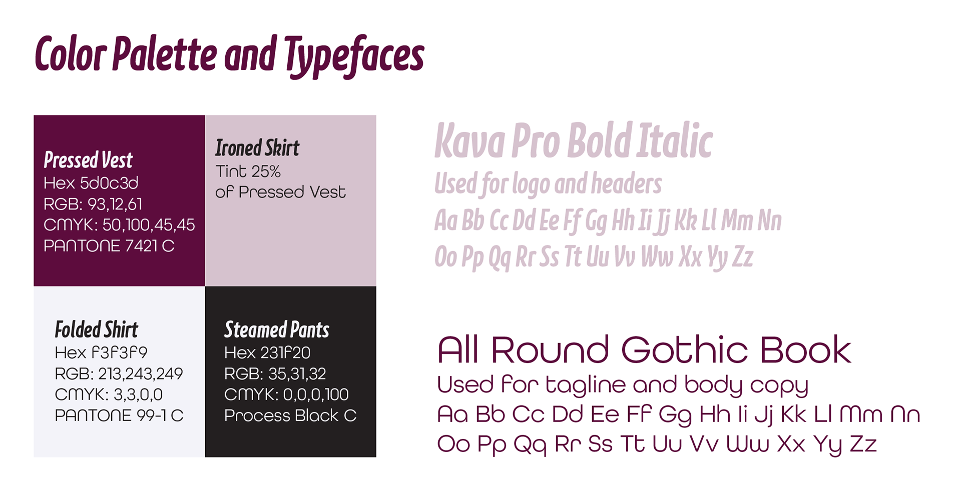
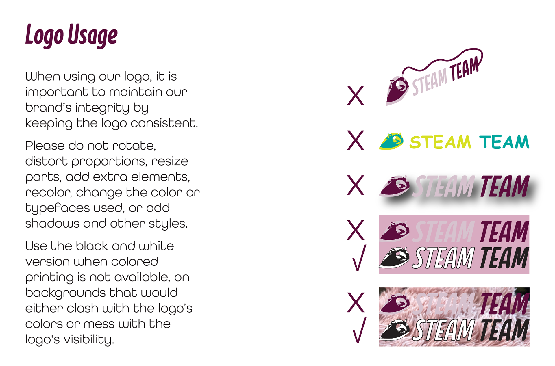
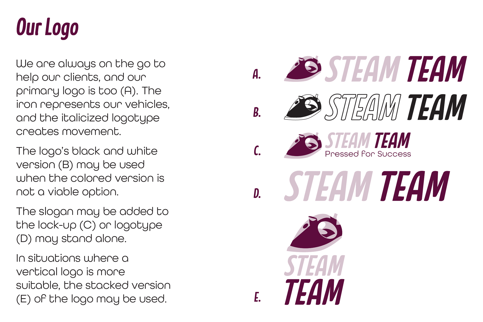
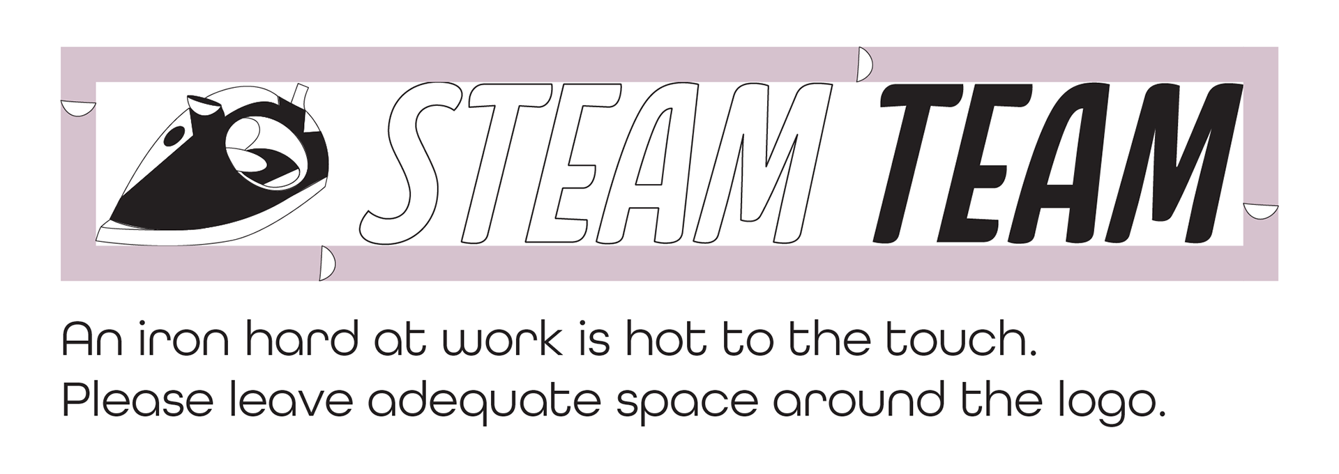
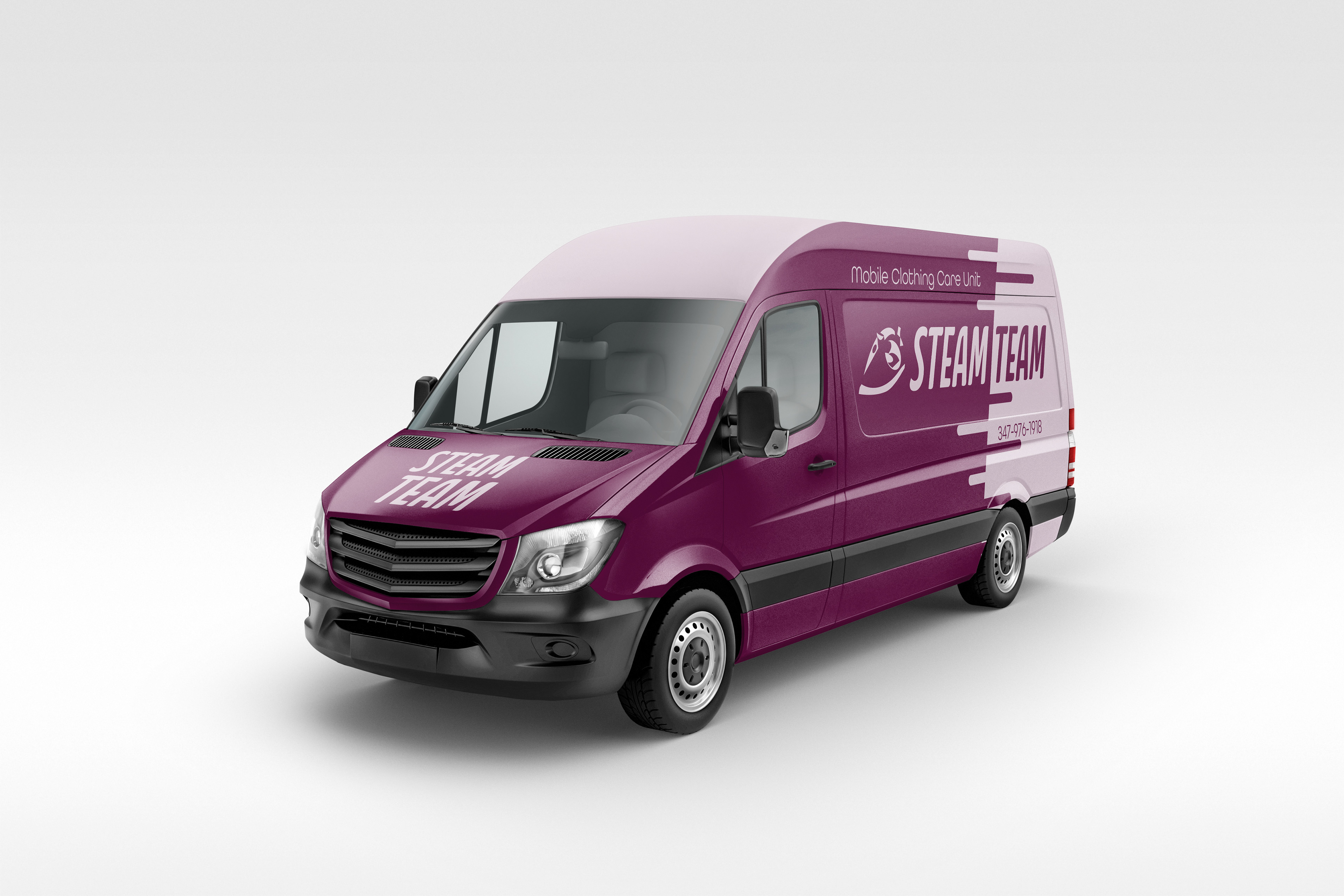
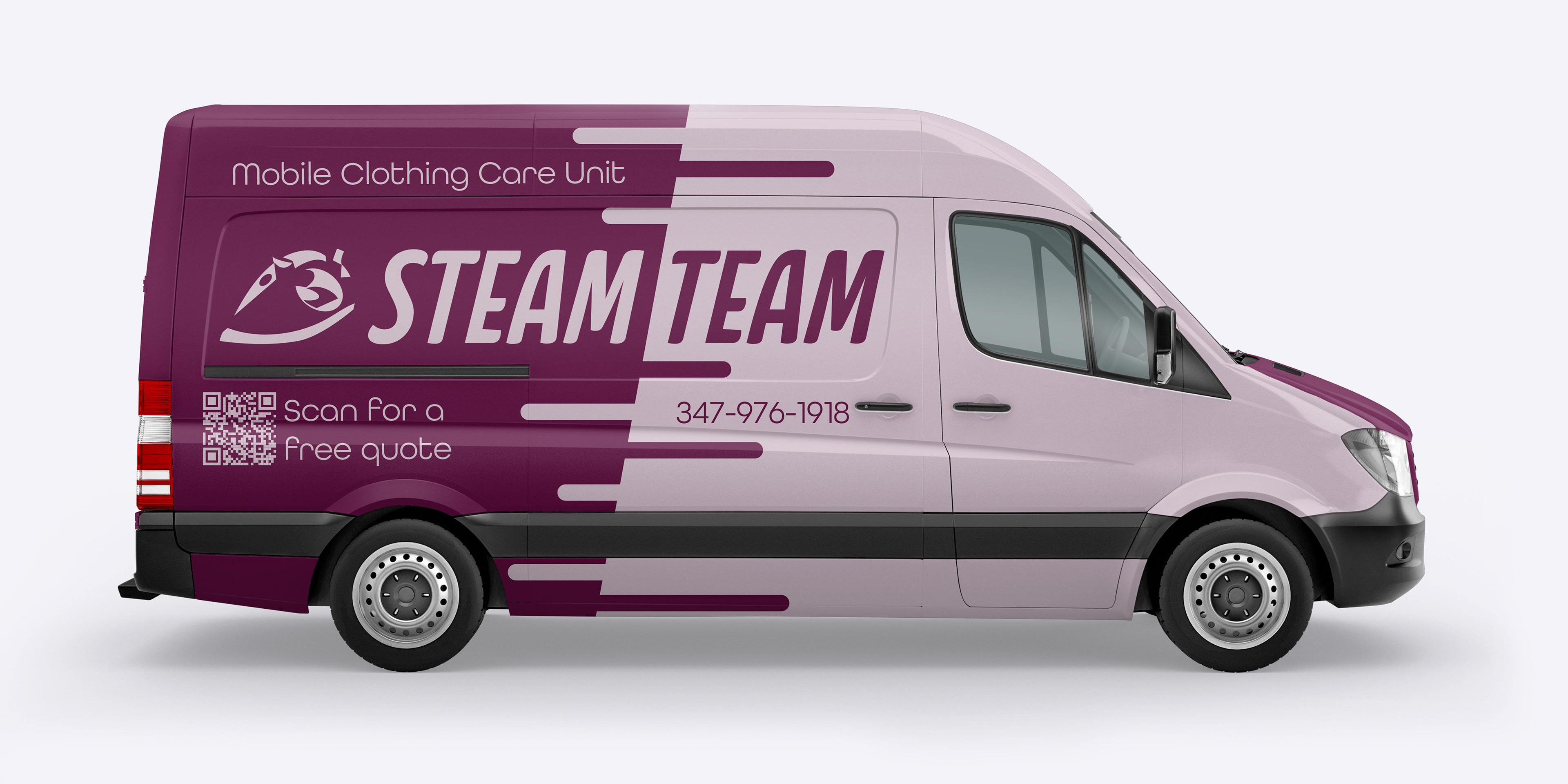
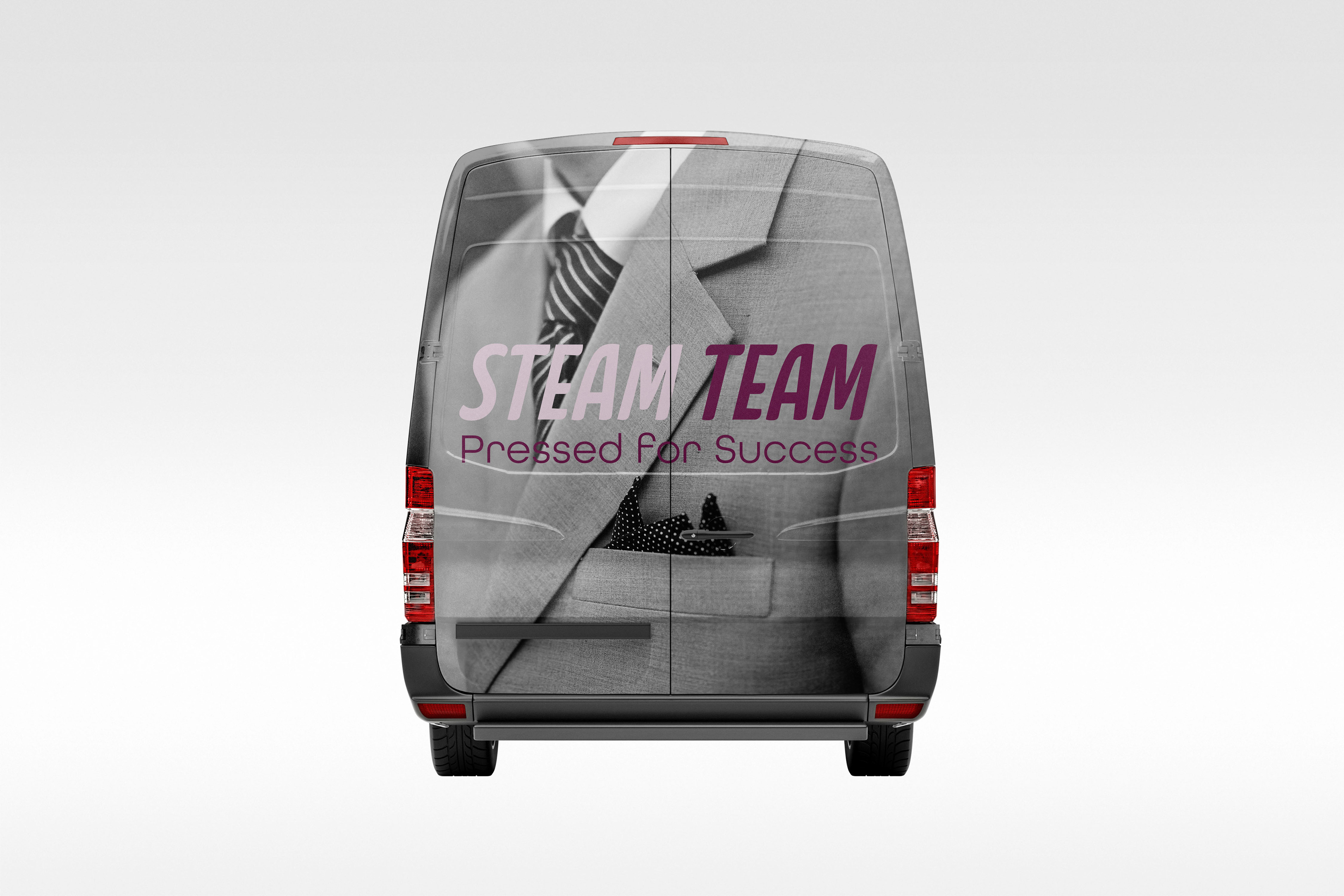
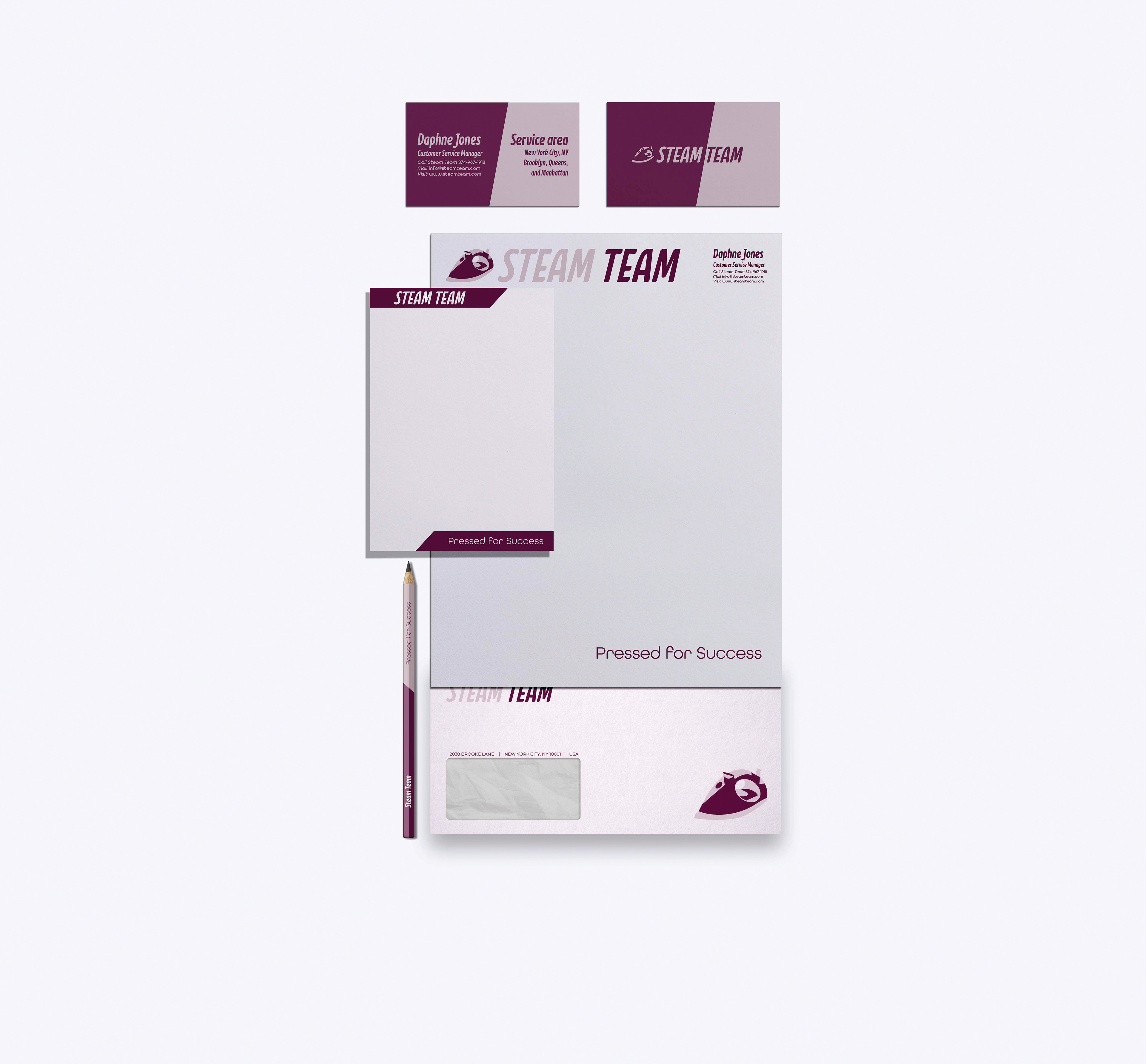
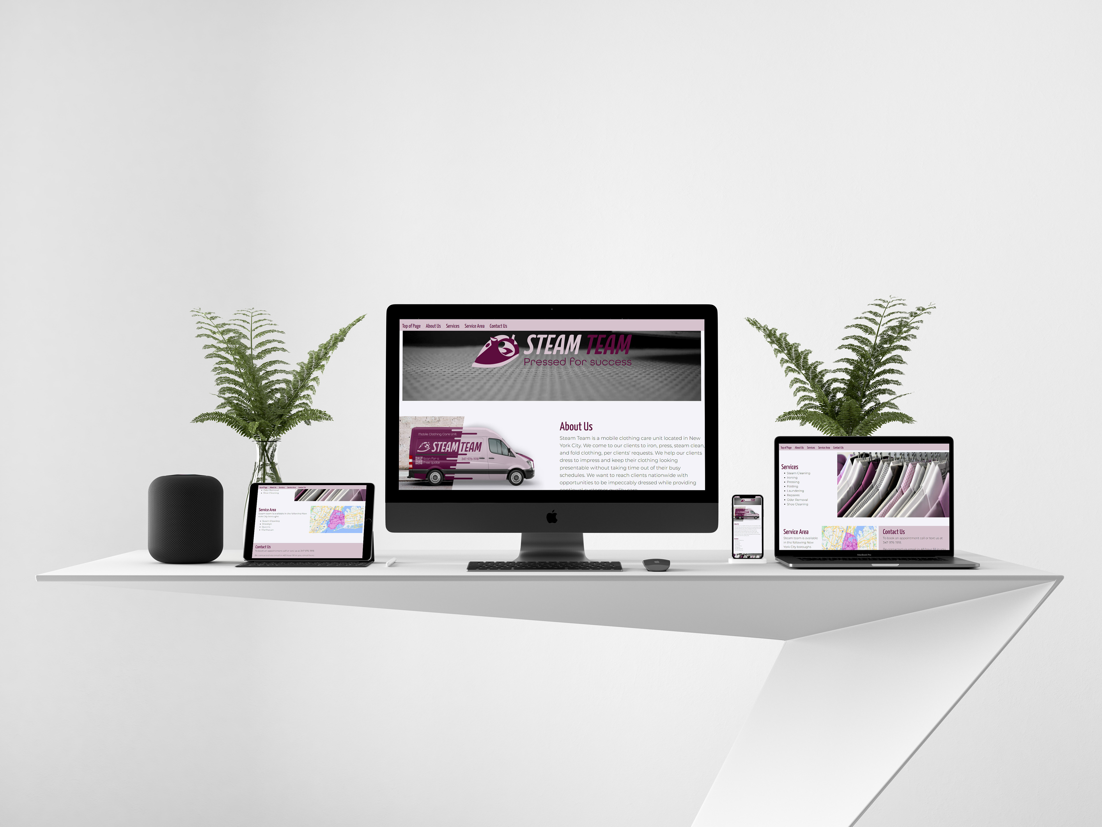
Steam Team—a wordplay on dream team—is a mobile clothing care and cleaning service. The iron's position reflects mobility as it invokes an appearance similar to a vehicle. The light and dark placements create highlights and shadows giving dimension to the mark. The logotype's curved style and gentle points complement the mark. In addition, italicized type creates movement in the design implying that the iron is traveling. The logotype, presented in all capitals, fills up the space giving the illusion of a reliable rectangle. The slogan "Pressed for Success" is a reference to dressed for success. The secondary type was chosen for its sleek appearance and the lighter strokes balance the primary typography. The logo uses a wine hue and a tint for luxury and sophistication, appealing to the target demographic. Using a tint of the color ensures a harmonious appearance. On company goods, such as the van or business card, the hue and tint can be applied at an angle behind the primary logo creating unity with the background. The design choice plays on positive and negative space within the mark and the angle follows the angle on the logotype. Additionally, cool white is incorporated to create contrast among the warmth of the main colors. Each color is related to a service offered. The secondary logo is designed for a situation where a vertical layout is more suitable than the horizontal layout of the primary logo. On the van, a QR code links to the coded responsive Steam Team microsite providing additional information about the company and services.