Design Objectve:
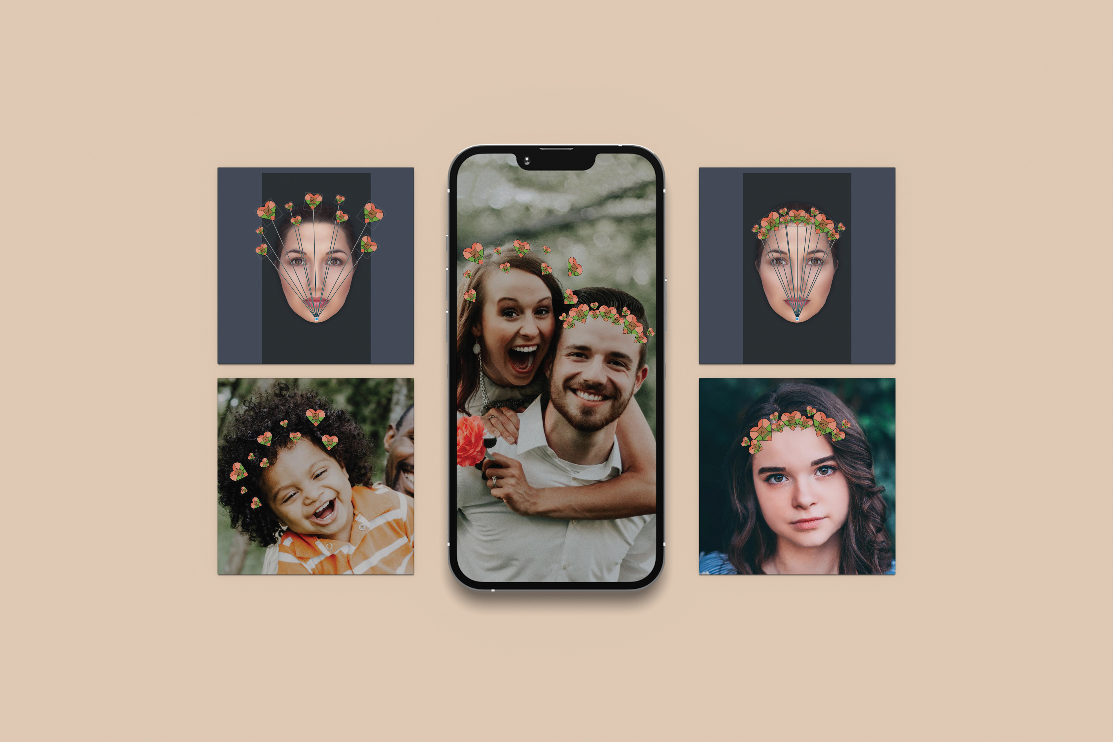
Chose a festival based in North Carolina and create a primary and secondary logo with style guide. Develop wayfinding signage for the event and an AR component.
Design Brief:
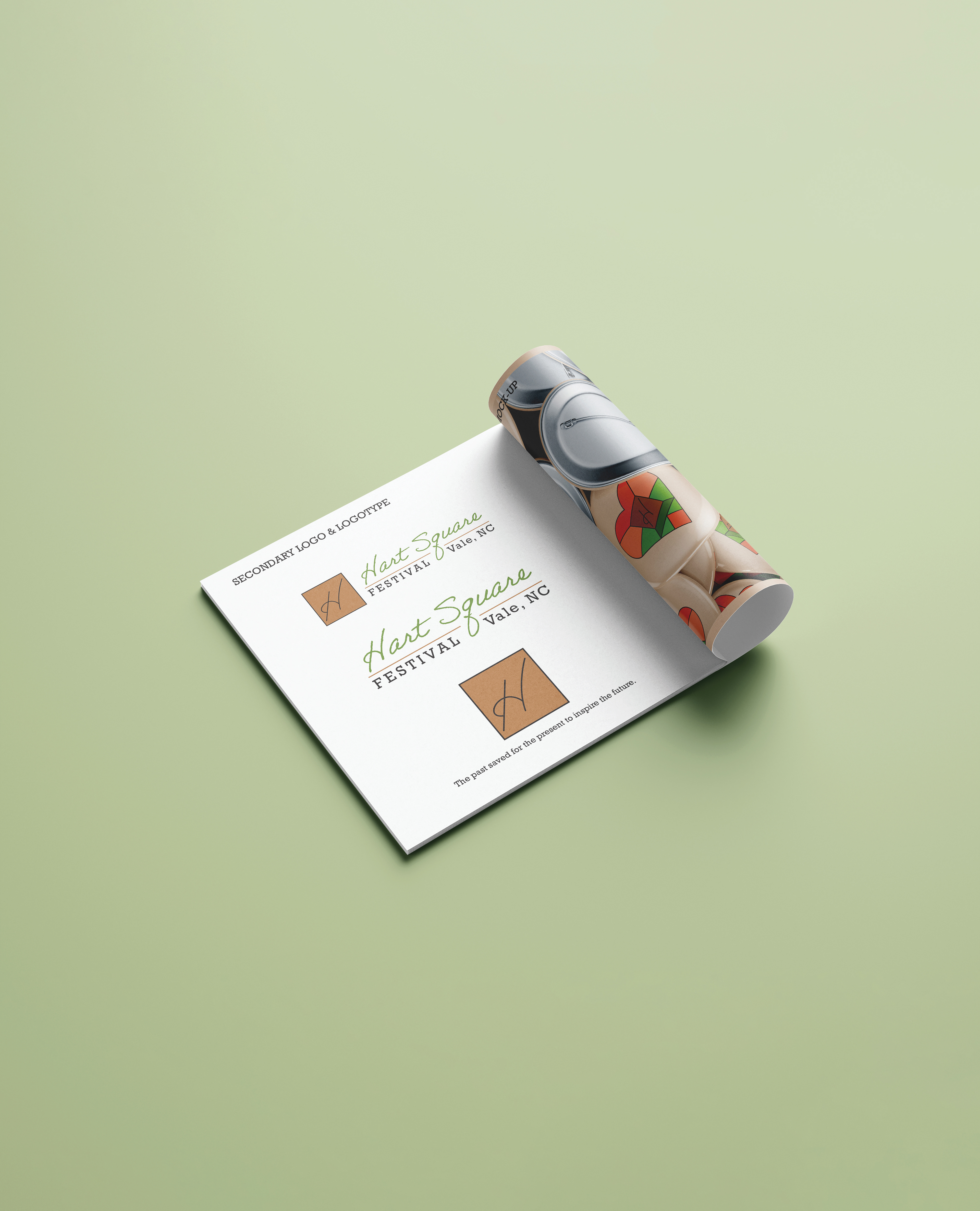
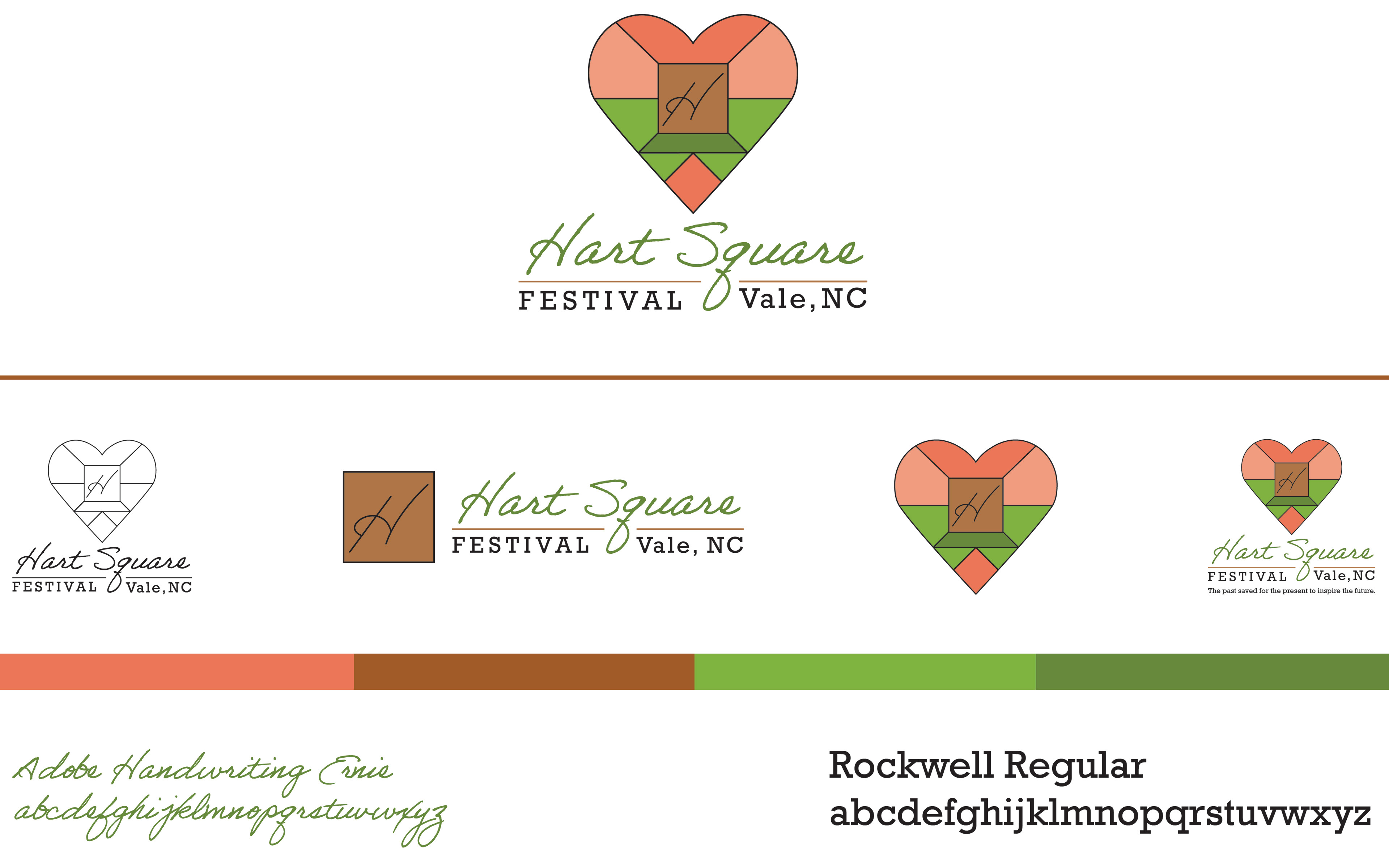
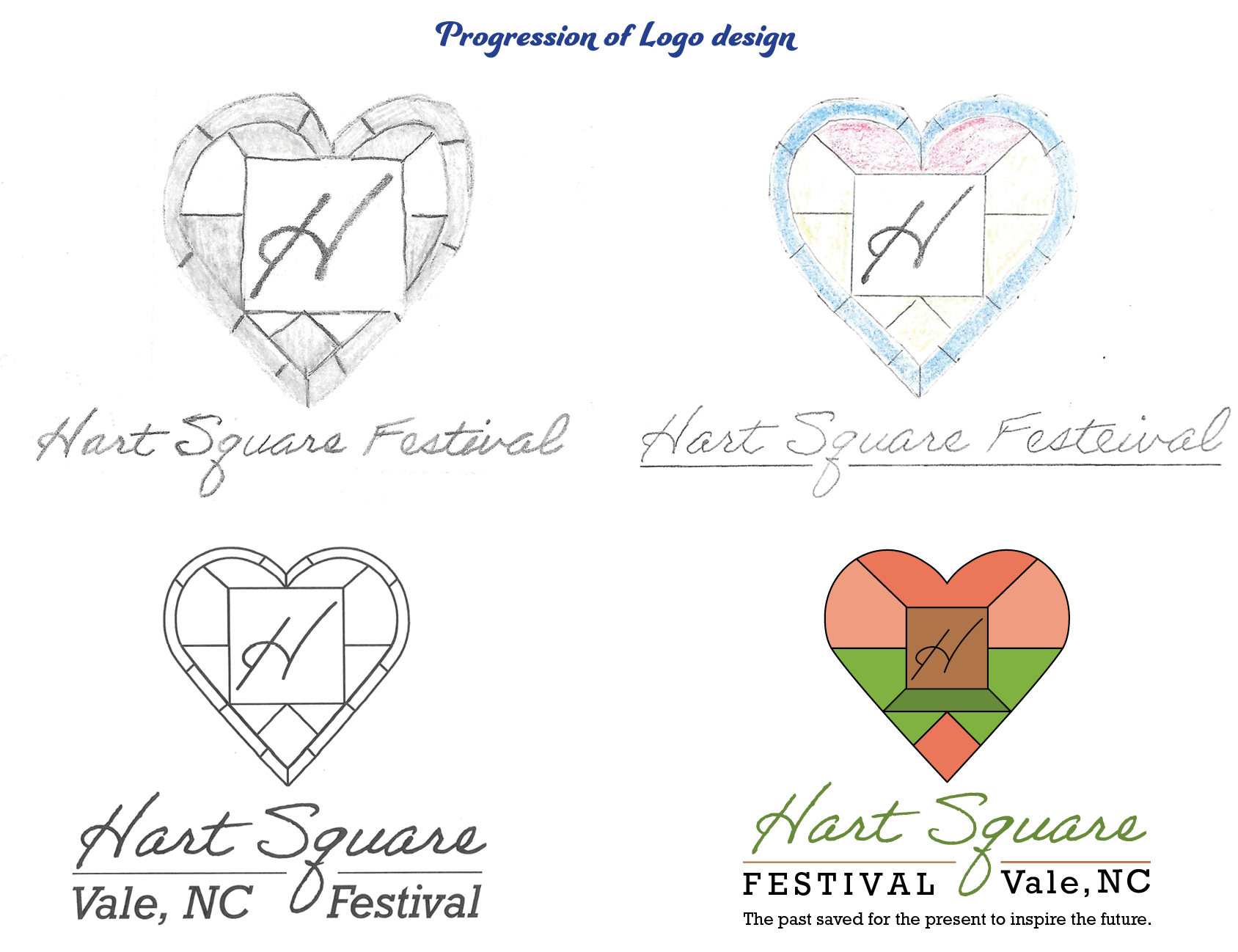
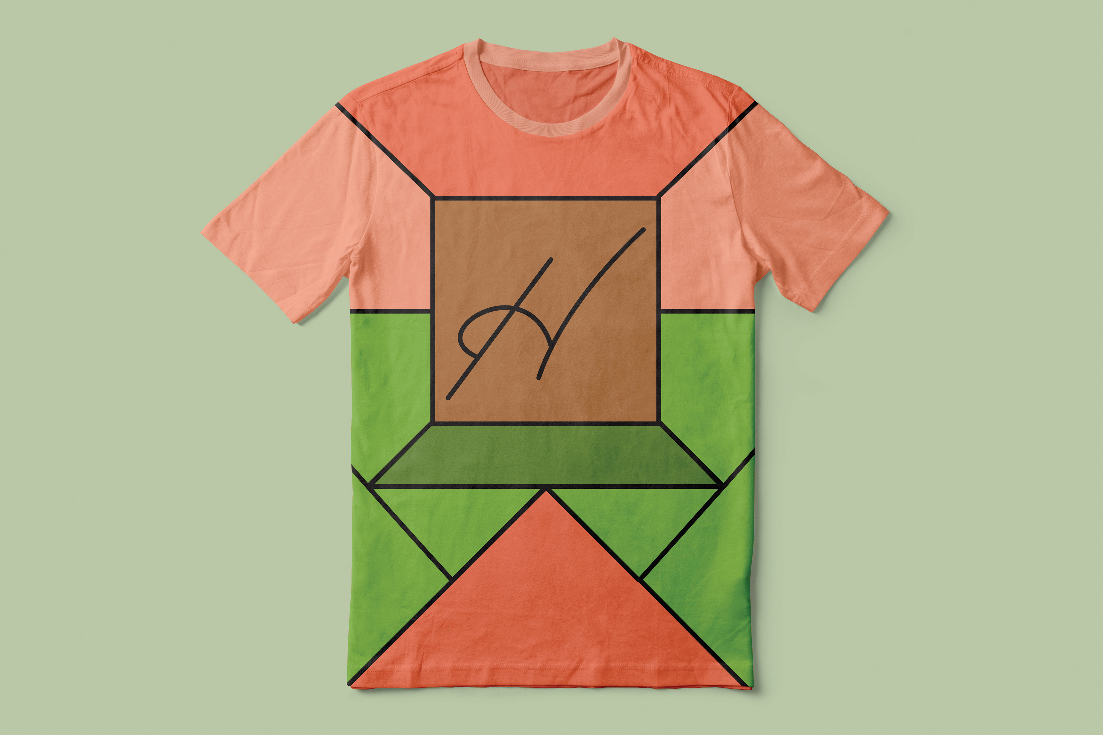
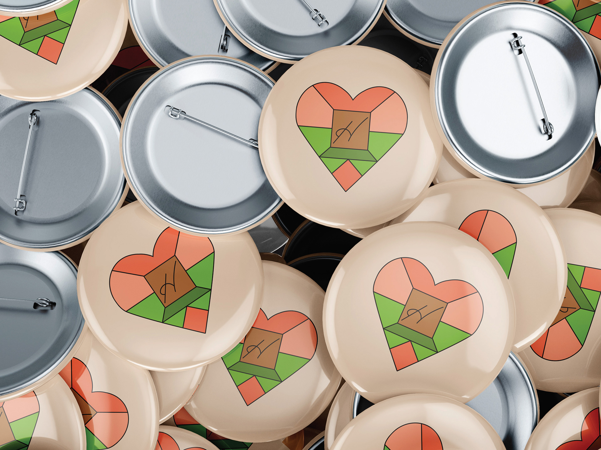
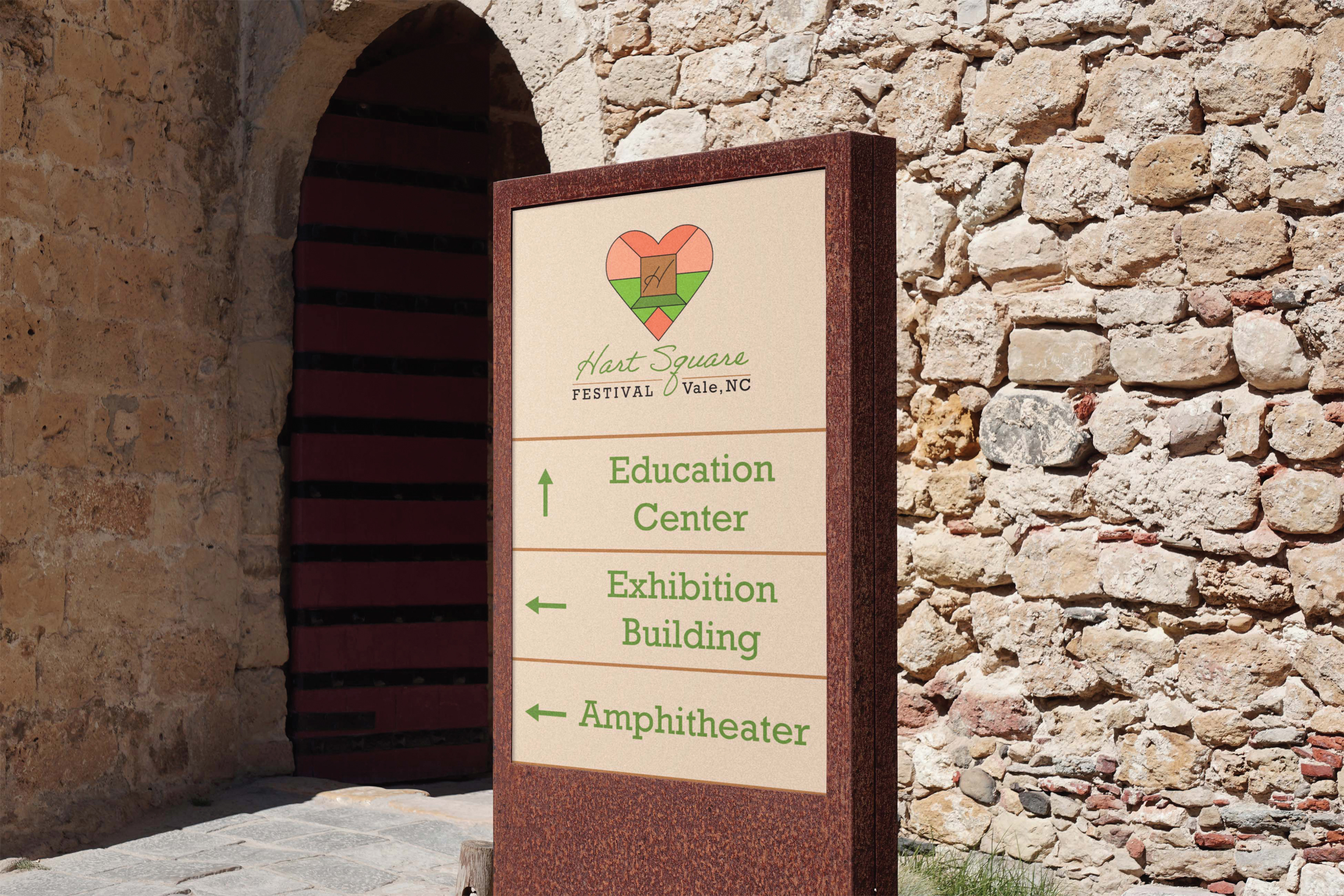
Hart Square hosts a festival in Vale, NC each year. The design draws inspiration from a stained-glass window on the property. A heart formed around the outside with a square on the inside is a visual play on the name. The logo has strong vertical symmetrical balance. Highlighting the outdoor autumn event, the design uses colors from nature in their warmer forms. Connecting to the location, colors are strategically placed. The brown square represents a wooden building. The greens represents the ground and a shadow cast from the building. For the all-day event, the salmon color on the upper half recalls a rising and setting sun. The bottom salmon piece is the sky's reflection in the nearby lakes. Multiple hues of the same color play into how stained glass offers variations in colors. The lines mimic metalwork securing glass pieces. Through continuation, the black lines funnel the eye toward the center making the brown square the focal point. The logotype echoes the natural color choices by representing green grass, brown topsoil, and black signifying subsoil. The primary typeface is a script type selected for its natural, hand-rendered appearance while the secondary typeface contrasts with a structured slab serif typeface. Slab serif was also quite popular in the 19th century, the period recreated by the Hart Square village. The secondary logo reduces the primary logo to the focal point. Wayfinding signage includes three types of signage. There is a hanging sign for arriving at the property. The entrance has a large permanent sign to mark the primary points of Hart Square. There are movable poll signs inside to guide visitors to locations relevant for special events. Through Lens Studio, an AR Snapchat lens was created for Hart Square. The Hart Square logo floats around the end-user’s head and comes in two variations of style.
