Design Objective:
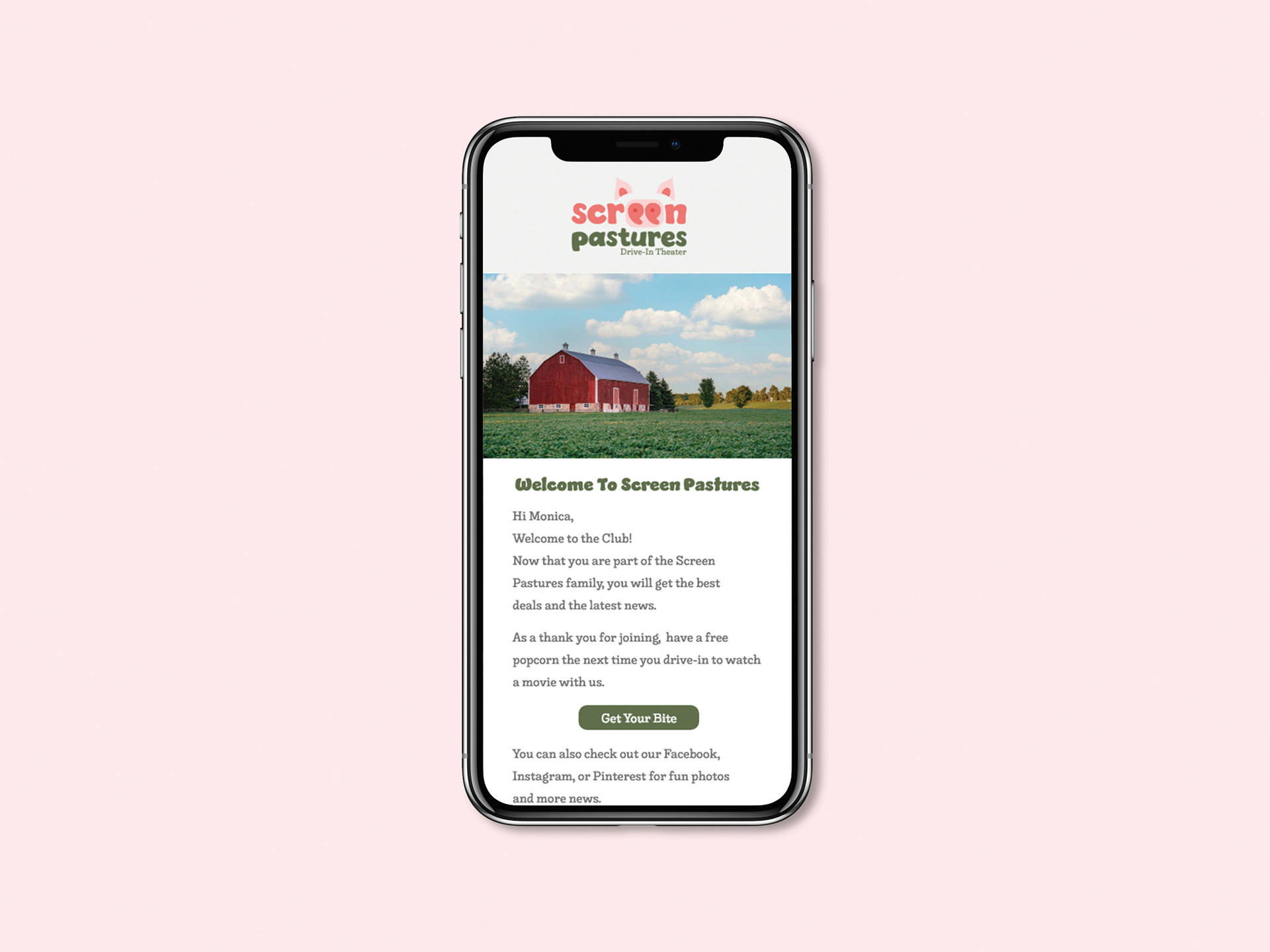
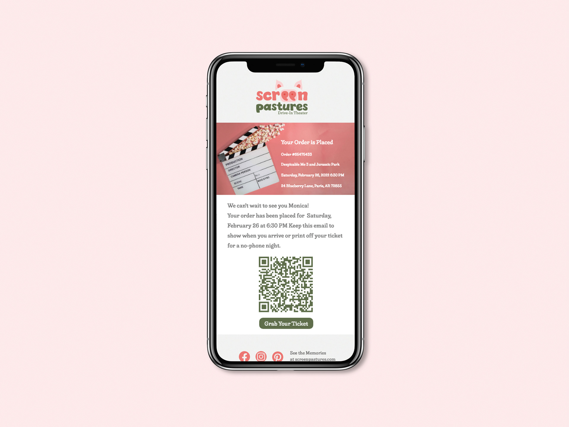
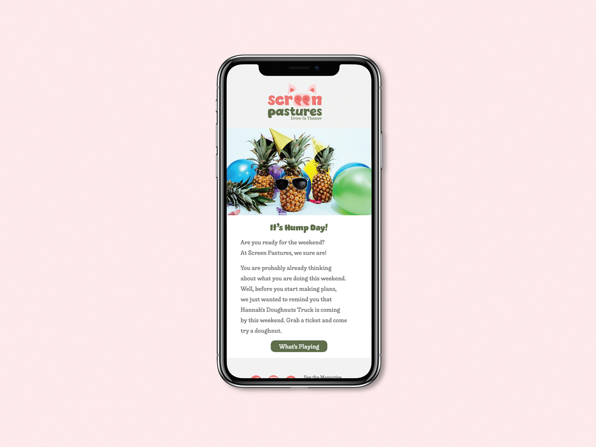
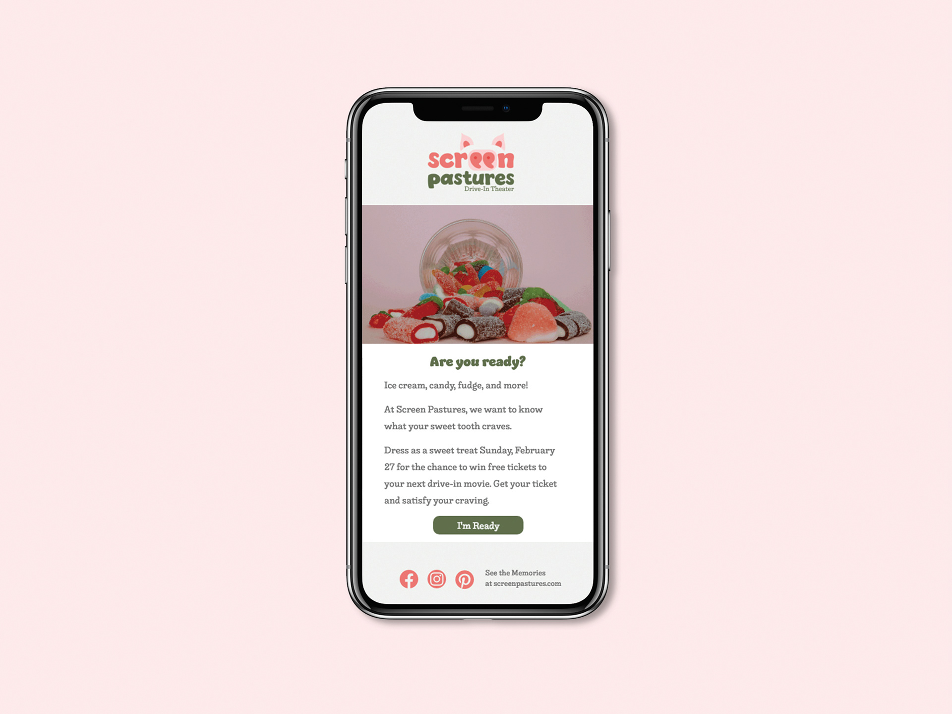
Create a drive-in theater with a typographically manipulated logo in full color and one color. Develop a marketing case study including social media platforms—with planned posts—email marketing and a responsive multi-page website.
Design Brief:
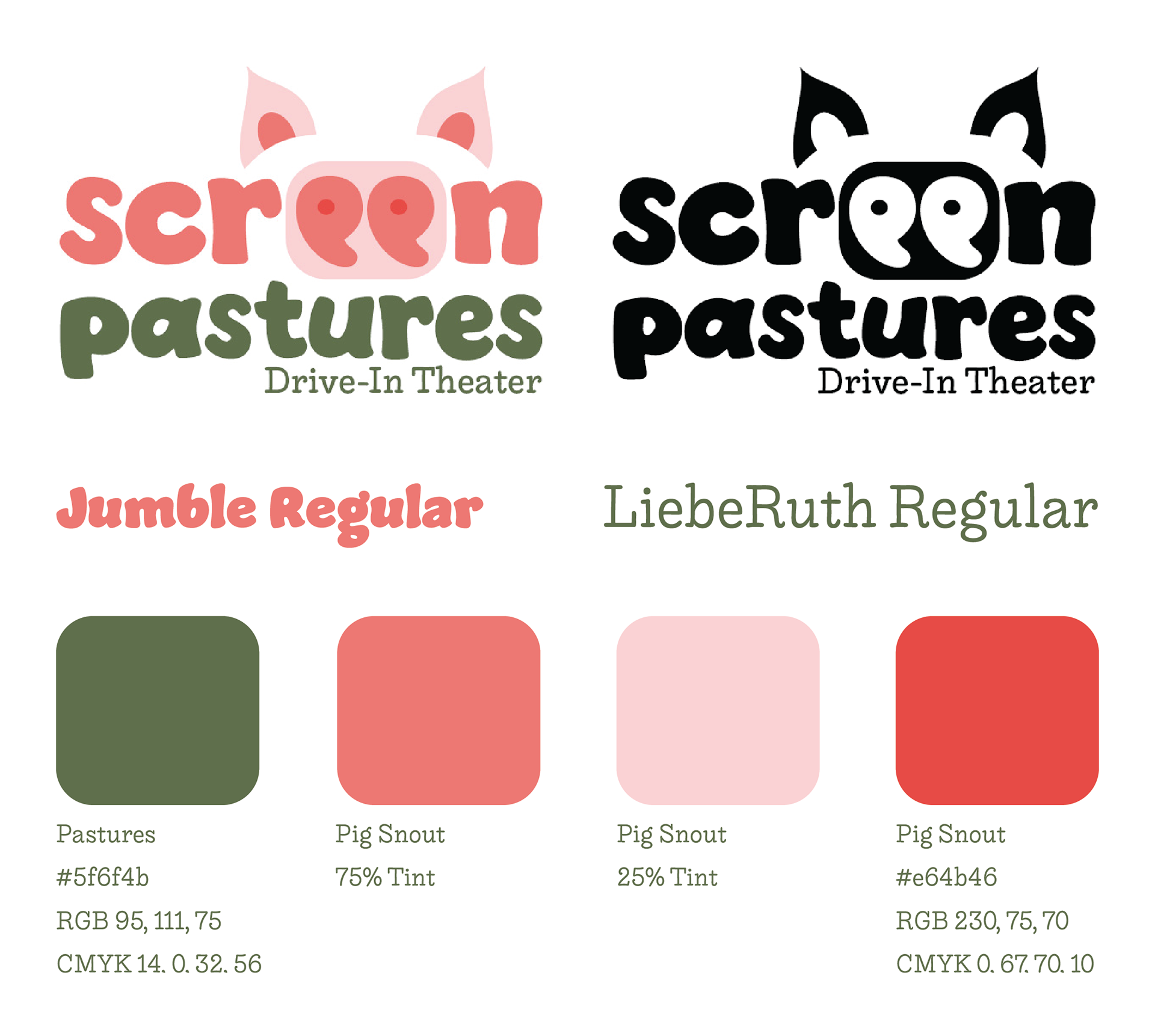
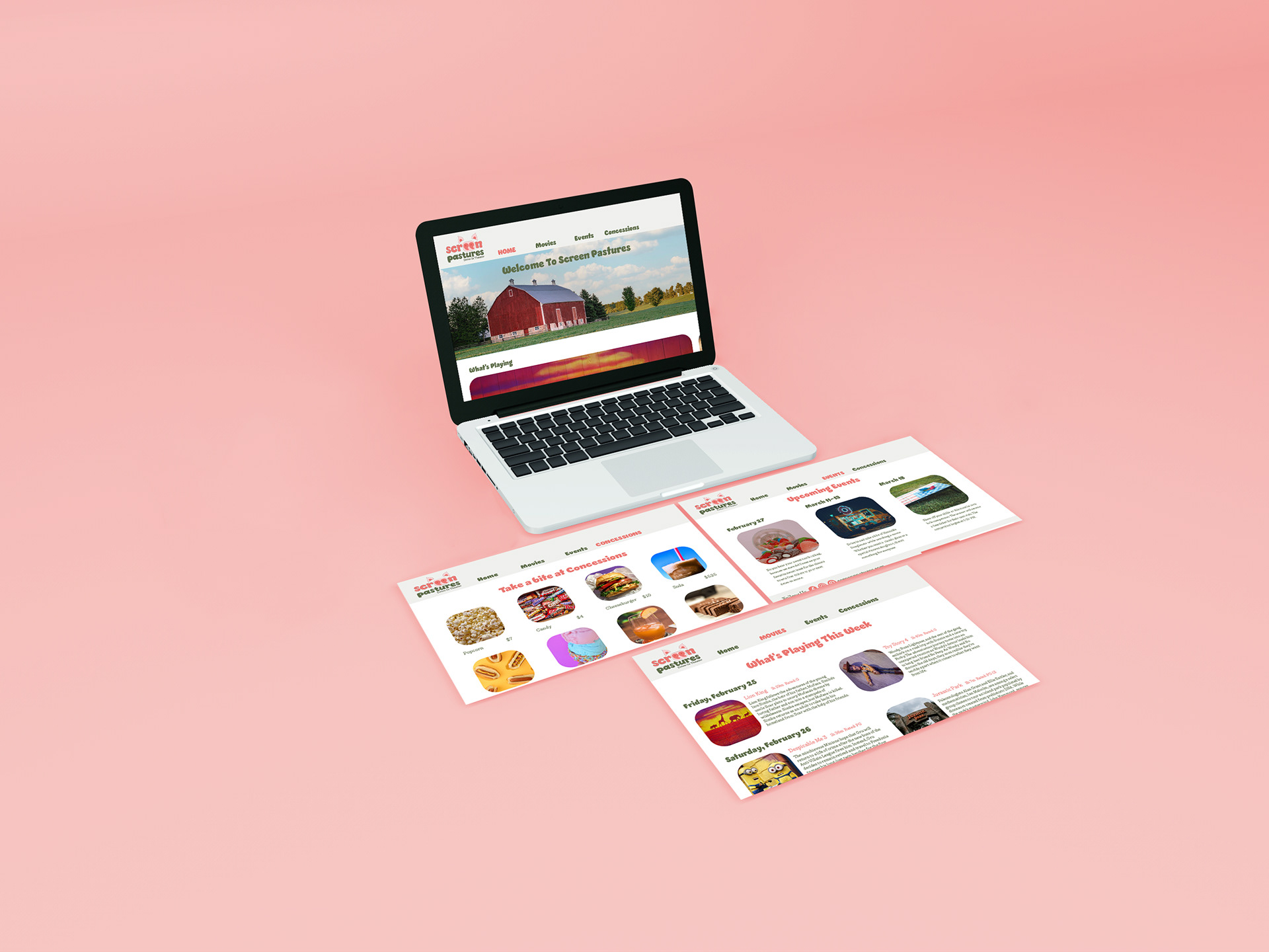
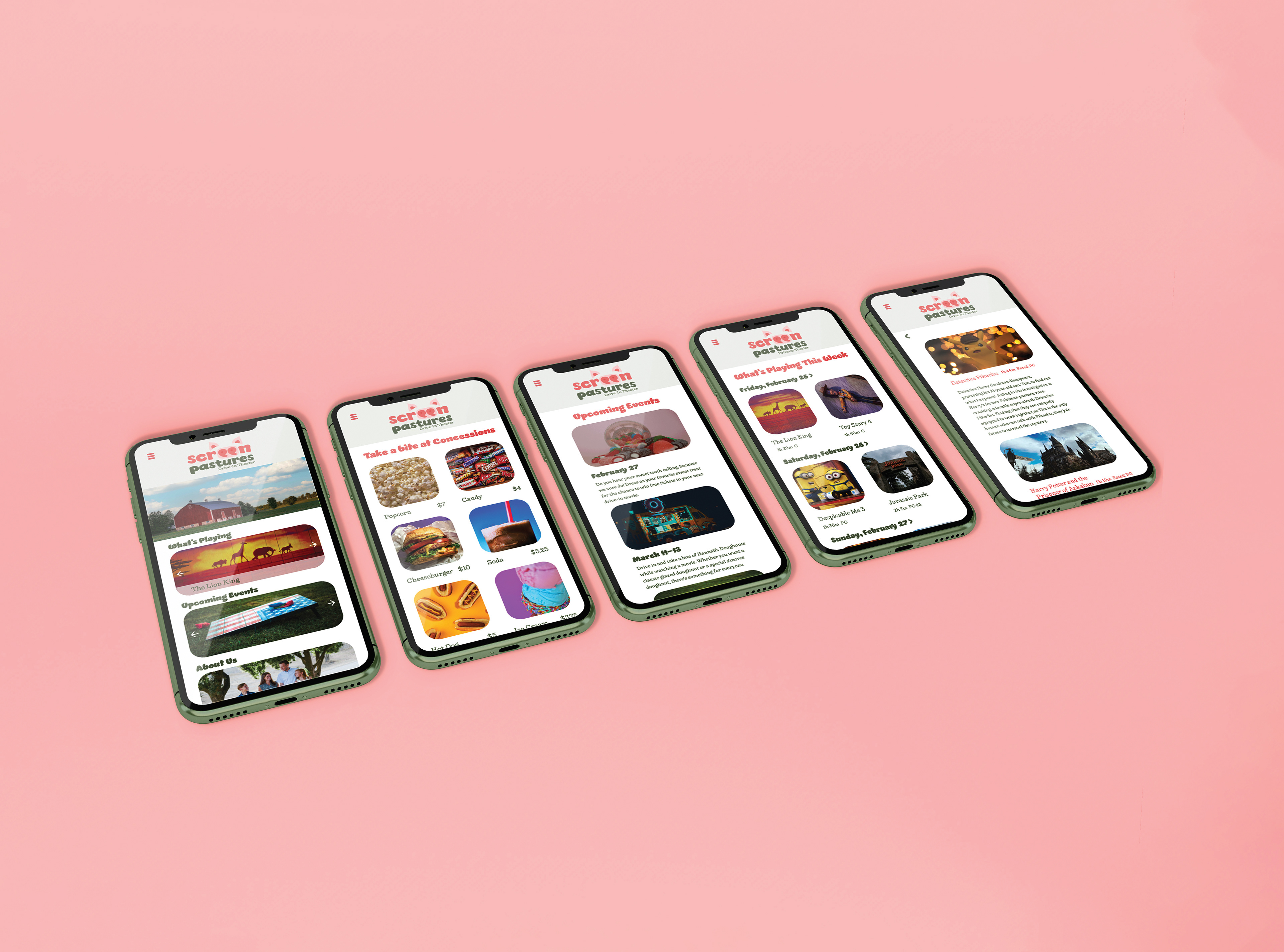
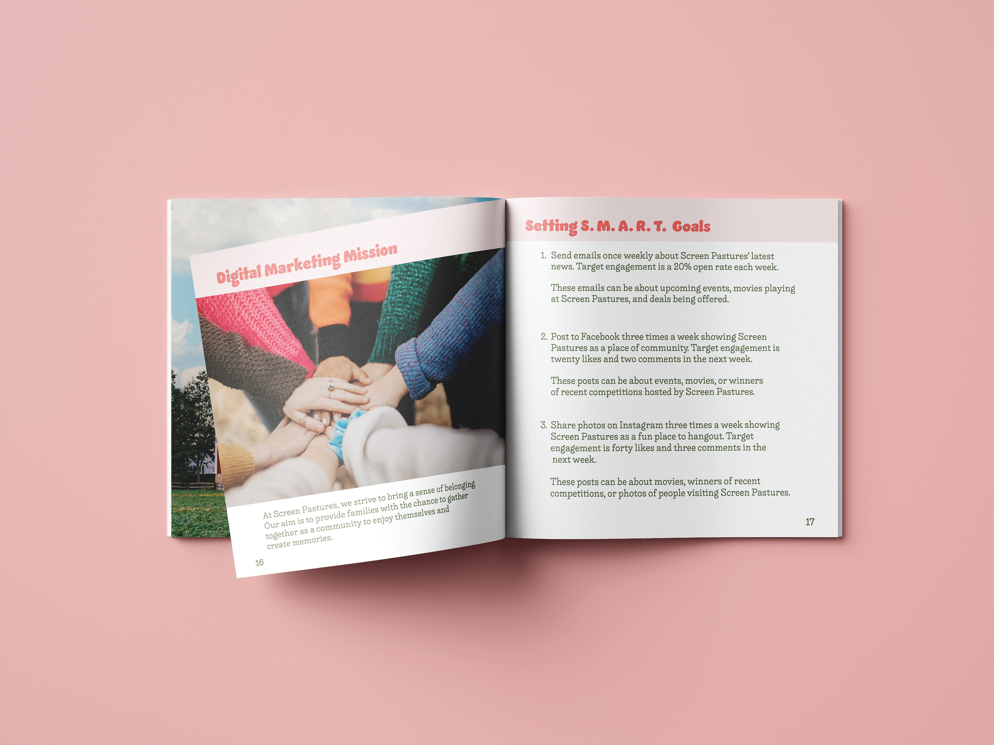
Screen Pastures—a play on the words green pastures—is a drive-in theater located on a farm. The logo plays on the farm setting with the “ee” being typographically manipulated into a pig snout and pig ears over the name. The primary typeface is Jumble, a graphic style sans-serif, with minor type manipulation made to the letters. To eliminate the pointed ends and more angular areas, the terminals and stems of letters were rounded out. Also, counters and apertures of letters were widened. Each of the adjustments make the type more friendly and welcoming in appearance. The secondary typeface is LiebeRuth, an unbracketed serif. LiebeRuth’s serif tips being rounded creates unity with the soft, curved terminals of Jumble. Jumble and LiebeRuth complement one another through the contrasting weight of strokes. The warm pink and cool green even out the temperature of the logo. The use of pink connects to the pig design and the green plays into the concept of pastures. Additionally, the secondary type being in green balances the pink pig ears and snout. Screen Pastures also includes a marketing booklet with information about the business and marketing research and strategies—such as core values and S.W.O.T. analyses—to help guide marketing efforts. There is a content calendar for three months of social media posts with images and a posting schedule for three social media platforms. In Adobe XD, sample emails and a responsive website for mobile and desktop have been prototyped.