Design Objective
Redesign the Conover Farmers Market logo with logo variations for the seasonal market events. Incorporate wayfinding signage for the market both internally and externally to guide clients. Include an identity package and marketing efforts for Conover Farmers Market.
Design Brief
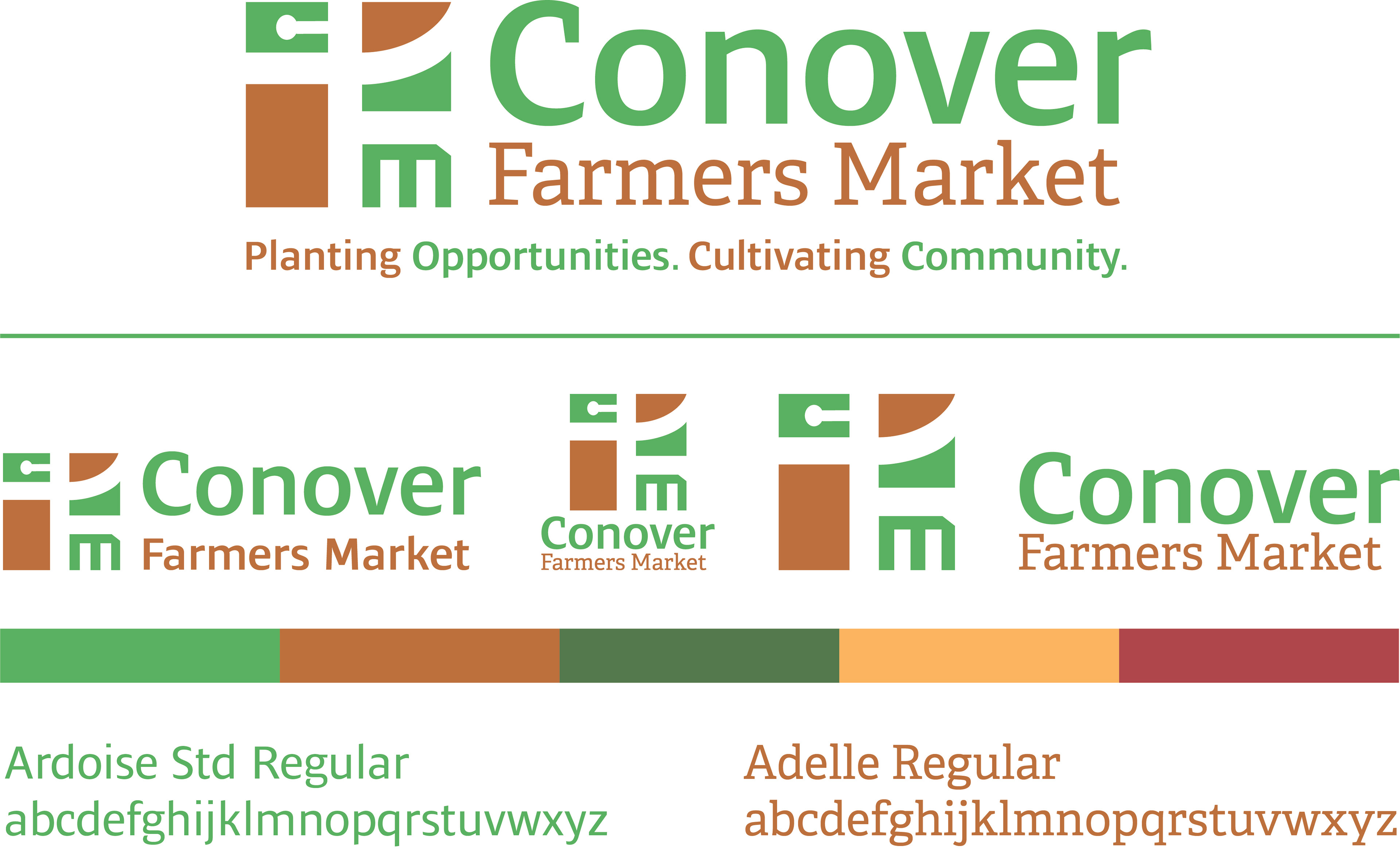
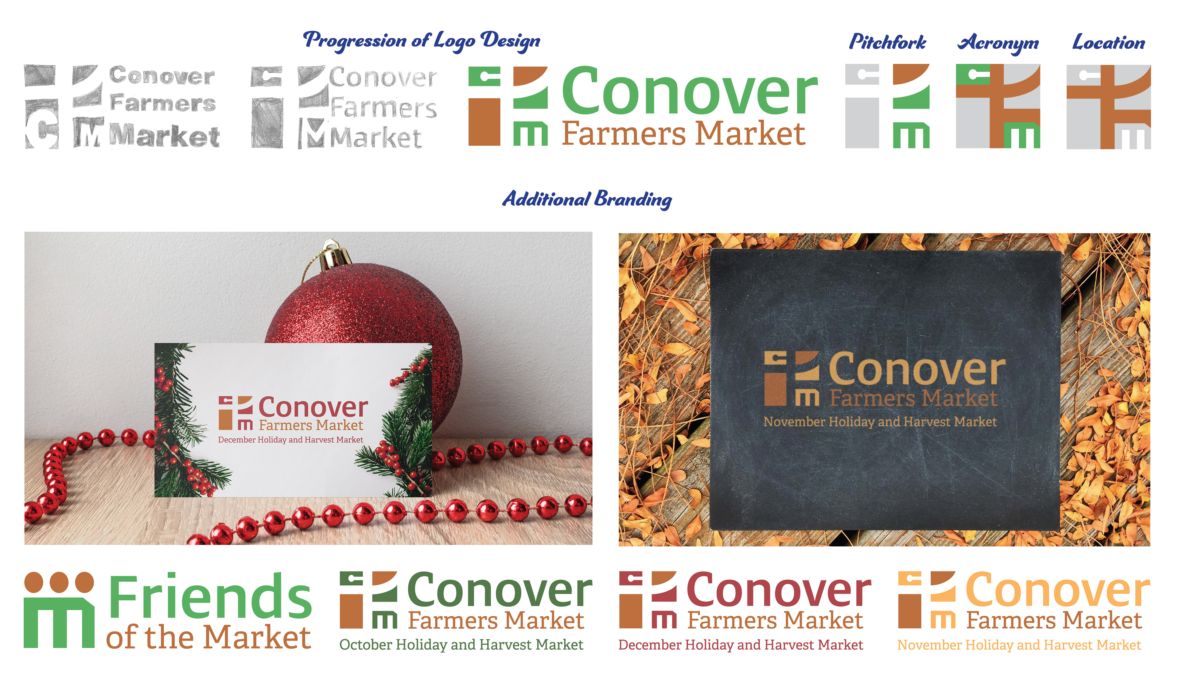
The logo bears the Conover Farmers Market CFM acronym, the
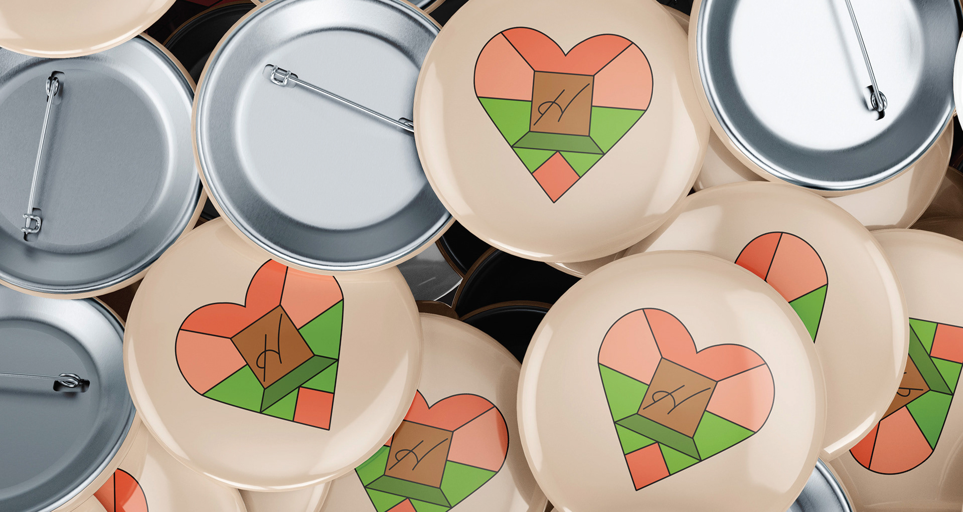
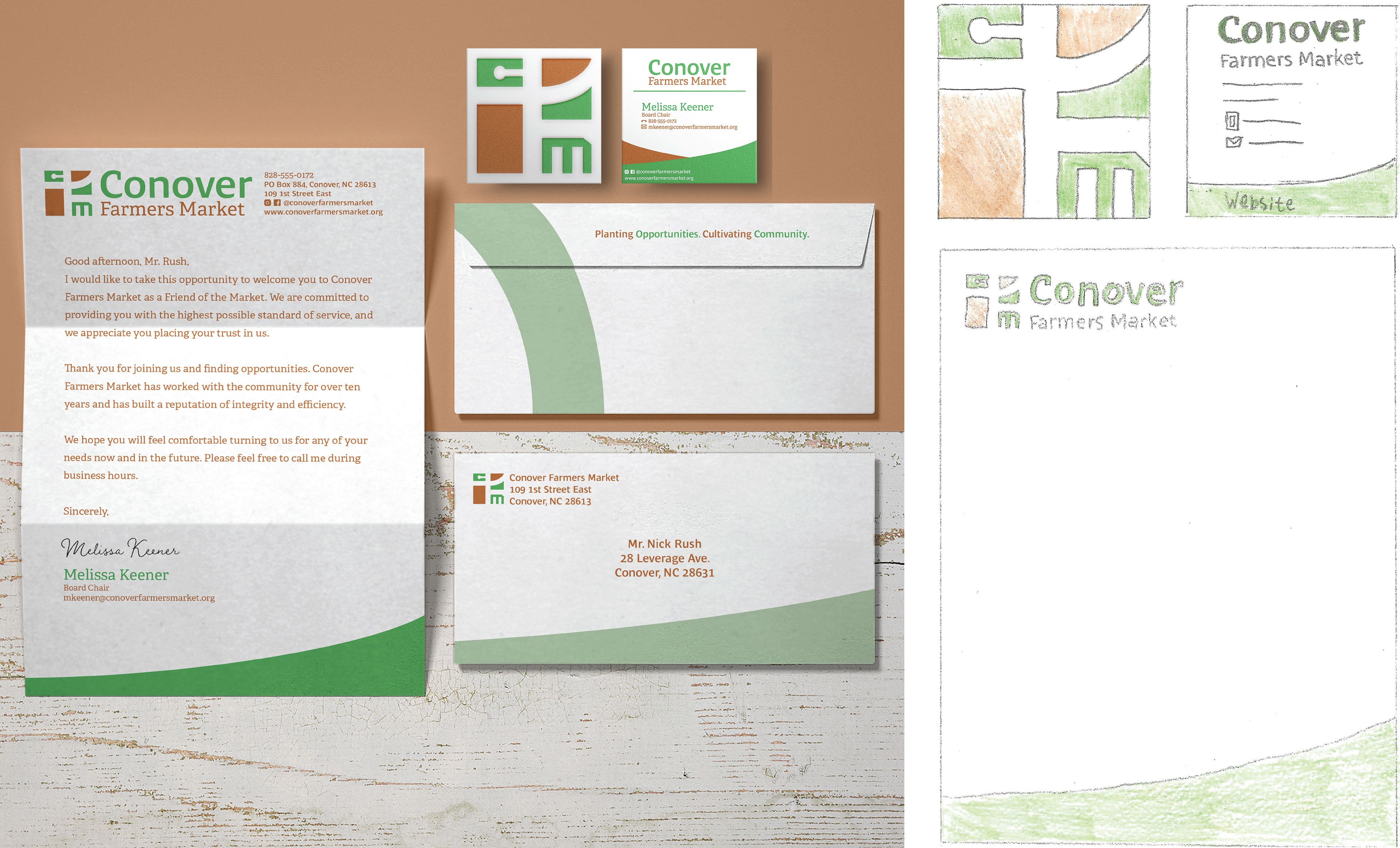
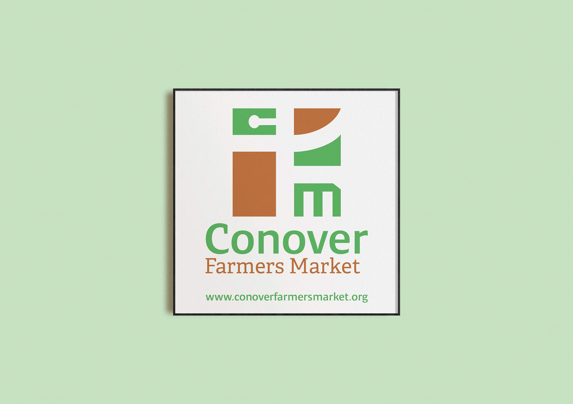
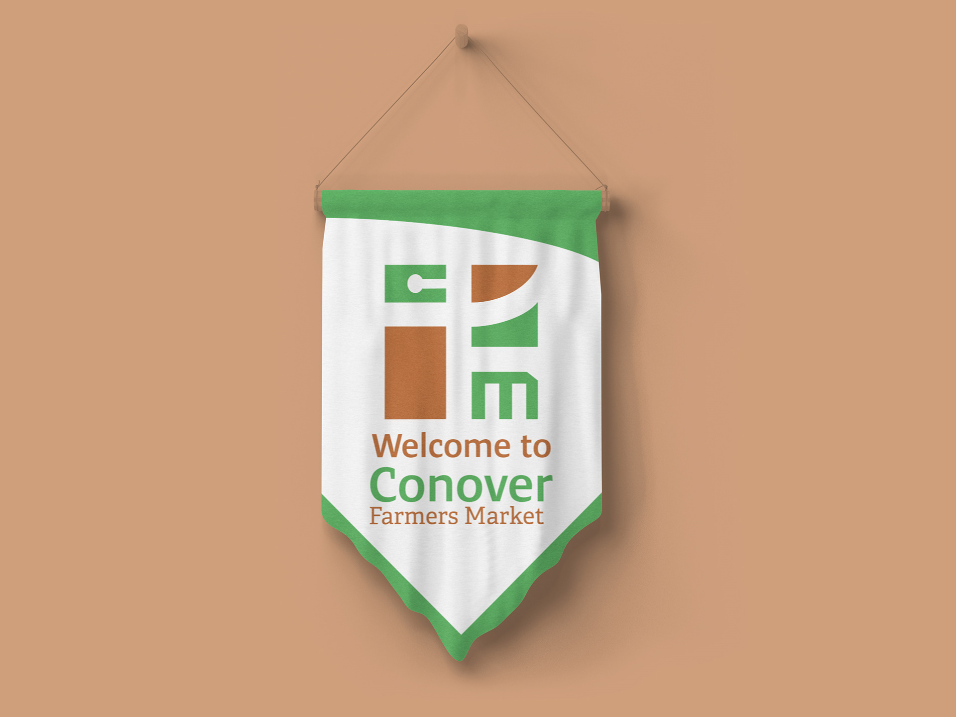
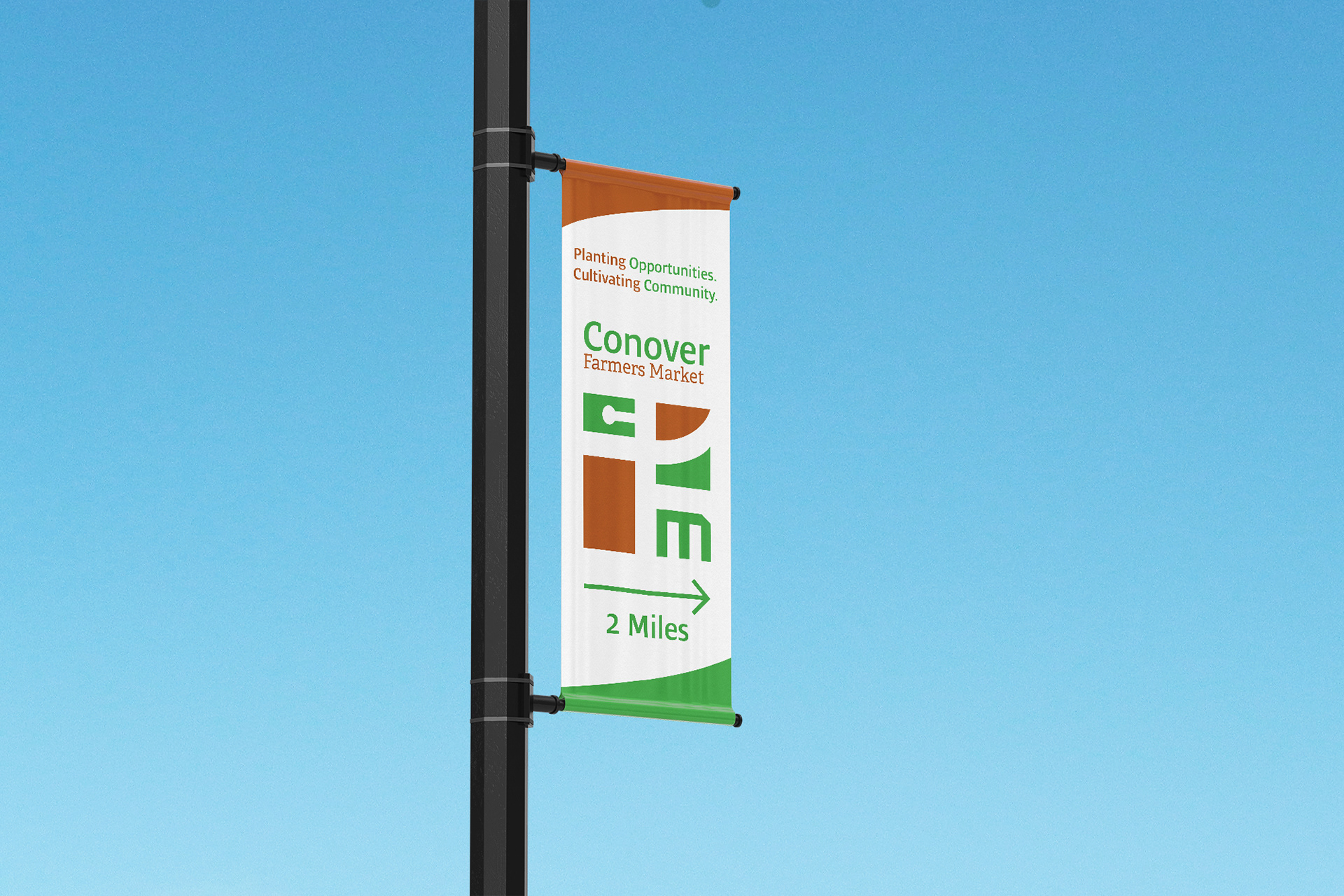
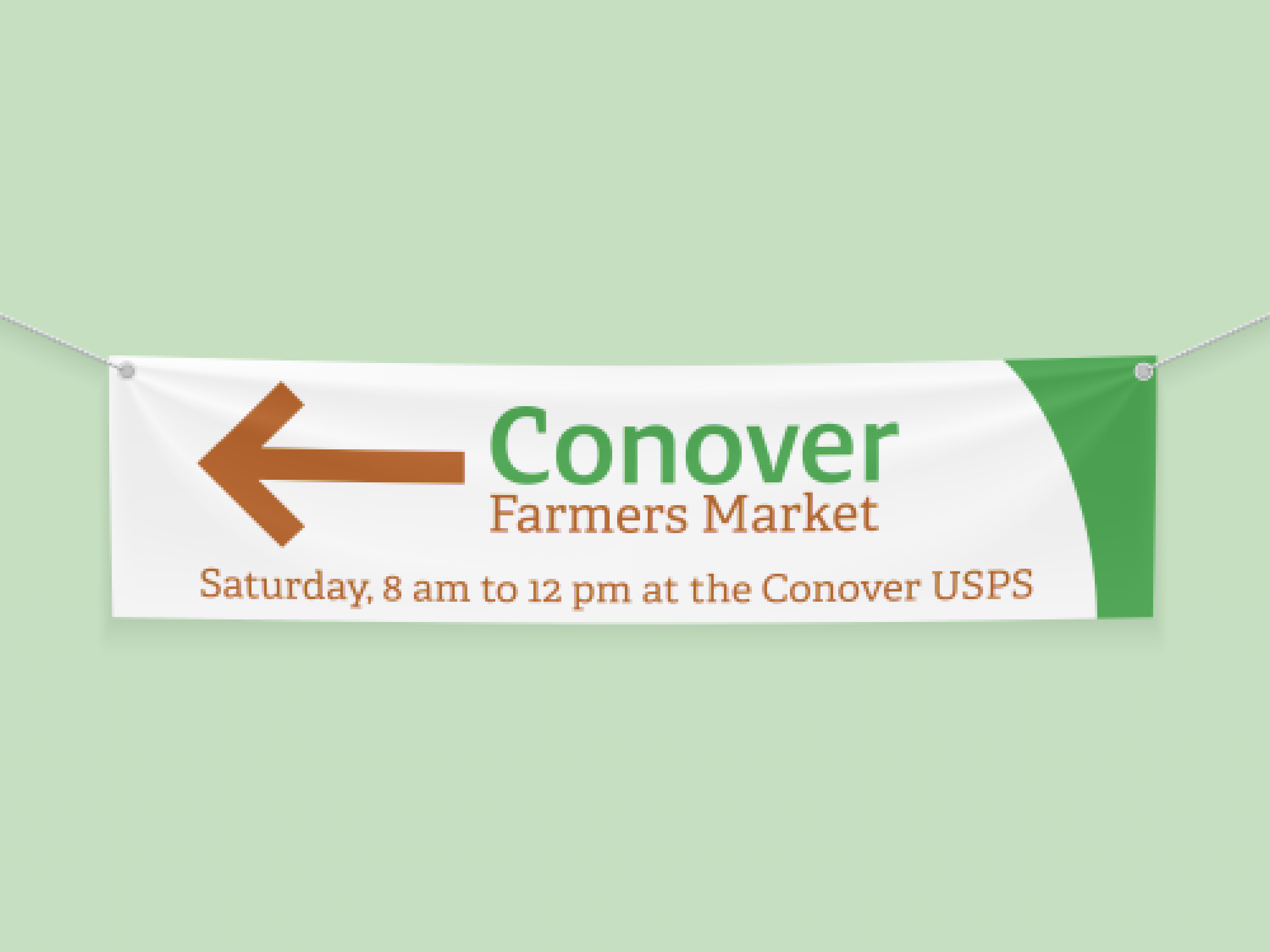
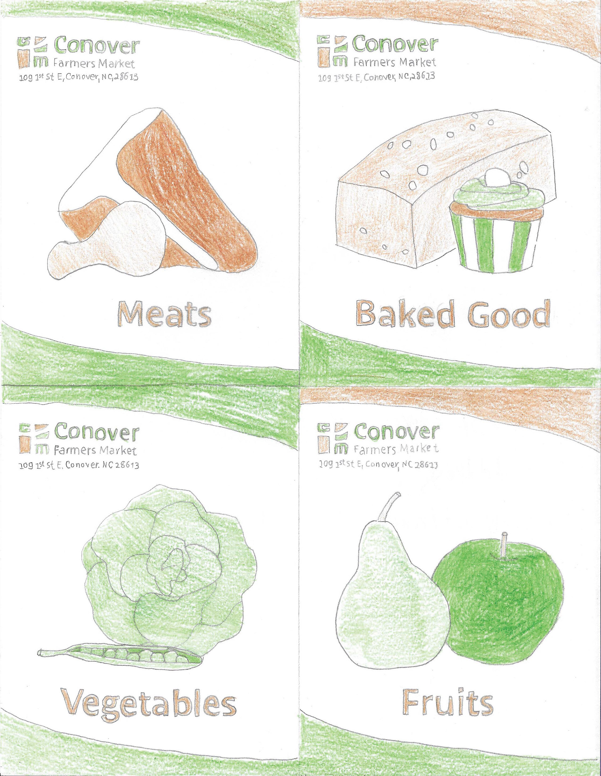
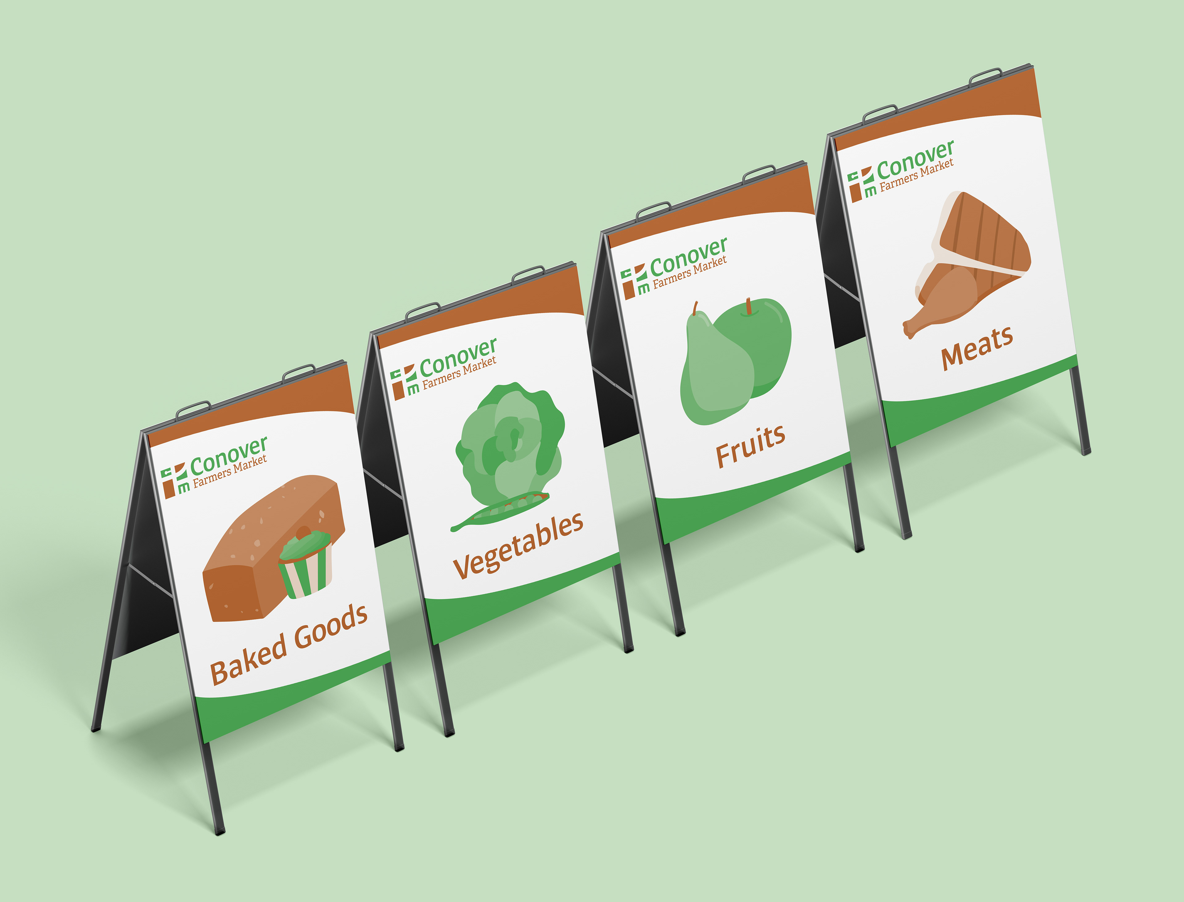
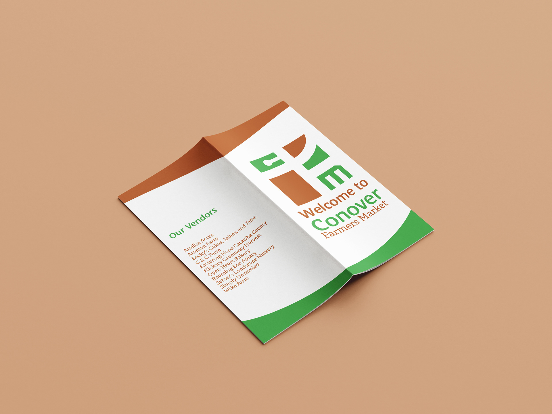
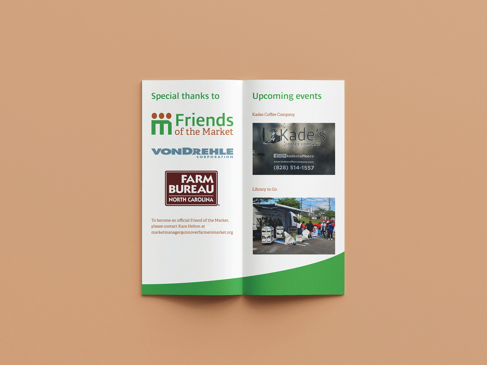
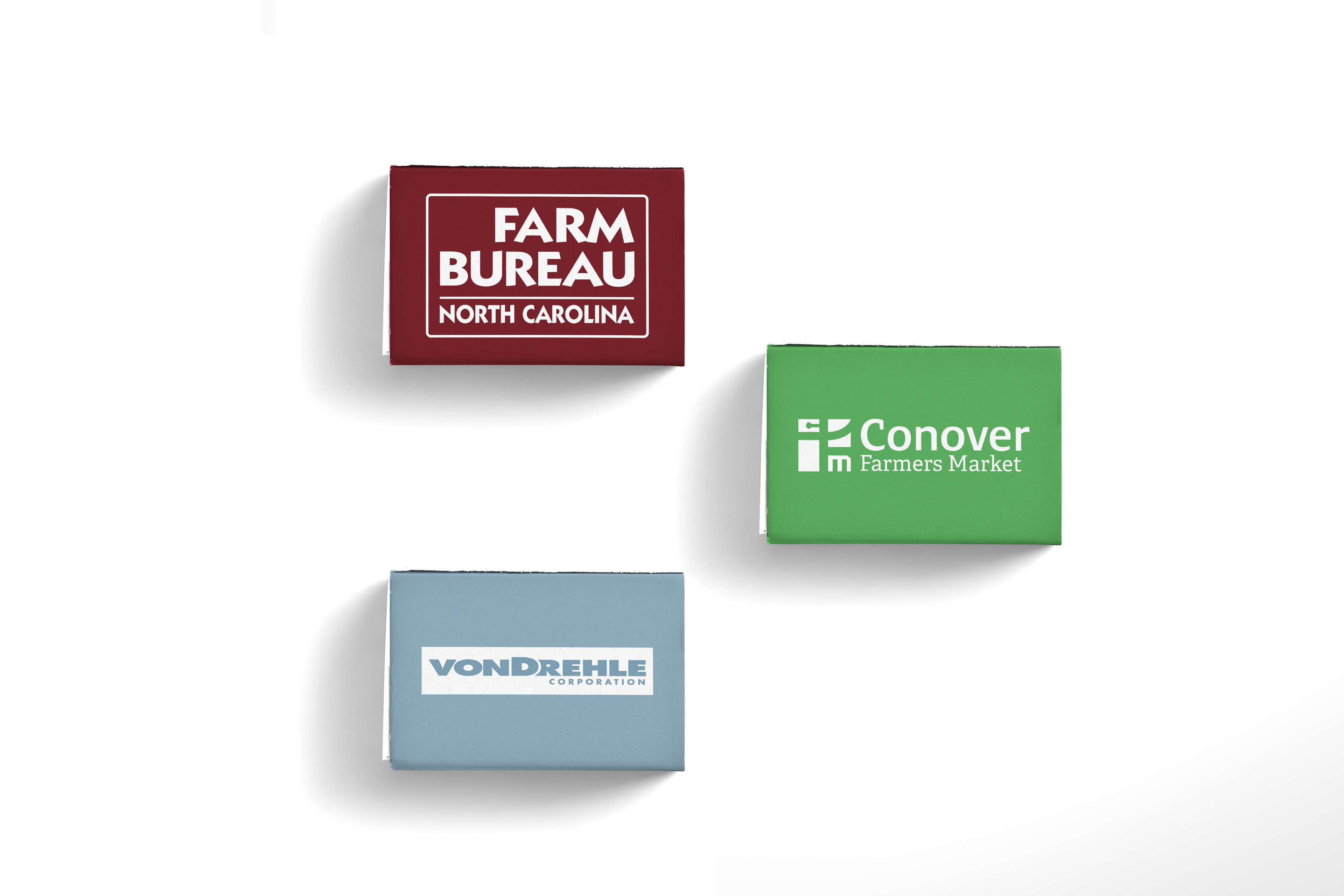
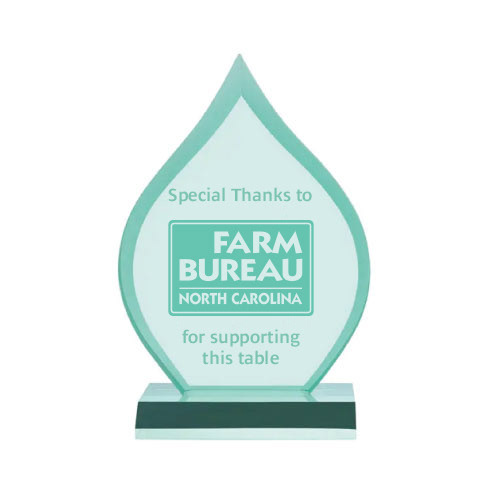
five-point road of Conover, and a pitchfork or fork representing the produce going from farm to table. Colors chosen for the primary color palette indicate growth, nature, and prosperity. In green, a more personal Humanist sans-serif typeface and in brown, a slab serif secondary type balance organic and structured type. There are also logo variations for the seasonal markets. The secondary colors represent the changing of seasons by changing like Autumn leaves. Supporters of Conover Farmers Market, Friends of the Market, have a special logo symbolizing a group of people. Their bodies form the M in the logo for the market. Other shapes mimicking the logo are used in the identity package, marketing, and signage. The identity package contains square business cards that complement the square logo, tinted envelopes for USPS guidelines, and letterhead containing specific information for CFM members or shared company information. Banners will guide customers to the market. When customers reach the market, they will find welcome banners and a sign out front. Inside the market, A-frame signs will designate vendors' categories. The first booth customers see is the CFM welcome station, where customers can sign up for newsletters and grab welcome brochures. The brochure includes a thank you to the Friends of the Market, upcoming events, and a list of vendors. Matchboxes containing seed balls with corporate sponsor's logos are distributed with CFM brochures. Sponsors who contribute at a higher level can have their name or branding included on a plant-in-a-mug kit. The items would also be used as promotional merchandise for CFM. Major sponsors can request to sponsor specific tables with a recognition trophy on that table.
five-point road of Conover, and a pitchfork or fork representing the produce going from farm to table. Colors chosen for the primary color palette indicate growth, nature, and prosperity. In green, a more personal Humanist sans-serif typeface and in brown, a slab serif secondary type balance organic and structured type. There are also logo variations for the seasonal markets. The secondary colors represent the changing of seasons by changing like Autumn leaves. Supporters of Conover Farmers Market, Friends of the Market, have a special logo symbolizing a group of people. Their bodies form the M in the logo for the market. Other shapes mimicking the logo are used in the identity package, marketing, and signage. The identity package contains square business cards that complement the square logo, tinted envelopes for USPS guidelines, and letterhead containing specific information for CFM members or shared company information. Banners will guide customers to the market. When customers reach the market, they will find welcome banners and a sign out front. Inside the market, A-frame signs will designate vendors' categories. The first booth customers see is the CFM welcome station, where customers can sign up for newsletters and grab welcome brochures. The brochure includes a thank you to the Friends of the Market, upcoming events, and a list of vendors. Matchboxes containing seed balls with corporate sponsor's logos are distributed with CFM brochures. Sponsors who contribute at a higher level can have their name or branding included on a plant-in-a-mug kit. The items would also be used as promotional merchandise for CFM. Major sponsors can request to sponsor specific tables with a recognition trophy on that table.
Recommendations were provided for social media posting, including schedules, content type and a hashtag campaign.

See the Conover Farmers Market Adobe XD presentation
To start, click on presentation. After Clicking, use the left and right arrow keys to navigate slides.
